White, Gleeson. “At the Sign of the Dial: Mr. Ricketts as a Book-Builder.” Magazine of Art. 20 (December 1896-November 1897): 304-09. Internet Archive version of a copy in the University of Toronto Library. Web. 5 November 2014.
Reprinted at The Victorian Web, 10 Nov 2014.
he quality which has distinguished Mr. Ricketts’s work from the first is “personality.” In Art, personality is but another name for originality; and, as in life, there are two sorts. The one fostered by ignorance, whether of social amenities or precedent; the other restrained or fantastic, pedantically simple or complex and profound, is alike based upon sound knowledge, which is power.
To-day a few designers, anxious for a short cut to success, appear to think that if they follow the track of a single predecessor they can slip through the thorn-brake with no personal effort and succeed in awaking the sleeping beauty. But the path must be cleared anew for himself by every true artist, who disdains the solitary trail as much as the common highway: for by either mute a traveller will find when he reaches his goal that the prince has already carried off the prize. Mr. Ricketts is himself always. It, is open In dislike his aims: but common fairness must admit that they arc his own, and owe little to any predecessor. If the school of Rossetti — does someone whisper? Yes, in one sense; but only in the sense that the younger Pre-Raphaelite has learned from the sources whence the earlier drew his inspiration, and first gave expression to a certain intensity new to English art. Besides, Rossetti — maker of poems and pictures — was not to any extent a designer of books, and it, is in that aspect, we are considering Mr. Ricketts here.
In one aspect of his art Mr. Ricketts appears distinctly akin to Rossetti, for he is dowered with the highly nervous temperament which feels the commonplace as positive pain. Most of us can hardly suffer gladly the reiteration of a monotonous note of a bell or the foolish ineffectual whine of a chained puppy. The repeated sound provokes a disproportionate sense of irritation. It is told of Walter Savage Landor that he hated mixing indiscriminately with his fellows because the platitudes which they uttered inflicted actual torture. “Fancy,” he said on one occasion, “if I chanced to he sitting by the sea, and a stout motherly female came and sat beside me, and, as a steamboat came in sight, said — “Lor, sir! what should we have thought of that when we were young?” The fatuous astonishment of the average person at, something that he recognises, but cannot understand, is as maddening to a thinking man, as the same person’s self-satisfied familiarity with other wonders which are equally beyond his comprehension.
It is hard that no word exists to describe accurately the builder of beautiful books. “Editor” or “publisher” expresses too much. The architecture of book-building; is at once an art and a science, and in many respects would show a near parallel to the third of the fine arte which is included in that trinity of which many believe that the last is also greatest. But it is wiser to accept them as equal.
Now most people still express surprise at the marvels of printing; and still show apparent satisfaction with the meanest and ugliest example that art, which, they recognise, has done so much to change the life-history of the world. They will gaze in open-mouthed astonishment at so many thousand copies an hour being thrown off steam presses, and yet purr with approval over the hideous volume which is the result of all this applied mechanism.
The artist is always amazed, and is for ever appalled, by common accidents of light and movement which do not excite the man in the street in the smallest degree. The emotions which move an artist to joy or grief seem the veriest trifles to the orthodox British citizen: while all the toys of the taxpayer — politics, religious factions, and other burning questions — interest the artist rarely, and seldom deeply. This may seem discursive; but unless you are willing to realise that to an artist’s eyes the production of a beautiful book is worthy of as much patient study as the result of an international cricket match, the passing of a Bill through Parliament, or the shibboleth of one sect as opposed to the shibboleth of another — until one is ready to allow that the subject which attracts him interests him as honestly and wholly as these other matters interest the larger number, it were foolish to consider seriously a few volumes issued under the direct control of a young artist.
The art of producing a book differs in infinitesimal degree only, whether it be a cheap and nasty edition or a masterpiece that satisfies the most exacting critic. The possible variations allowed in good Roman type few and exquisitely slight: the paper is necessarily paper, merely a poor quality for a bad book and a fine quality for a good one. Every page margins: those produced by artists of the past or present — are finely proportioned; the rest are left to chance. The ink is nominally black in each case: in the fine book it is really black; in the badly-printed one sometimes black, sometimes a dull neutral colour. The ugly book is usually, though not always, unreadable in some degree; its pages are often shiny and its type thin and meagre. But, after all, the possible difference between a beautiful book and a book of no beauty at all is a matter of surfaces, tones, and fractional variations of measurement — all trifles of small importance to the practical man of business.
But we must remember that trifles rule the world; a fraction of difference in the curve of an contour of a nose, separates a Cleopatra from a commonplace dowdy. In Art there is no such thing as a trifle; every item of perfection must be perfect, and only those who know the thousand and one possible errors which would, any one of them, mar a perfect book, can appreciate the result. The right thing often looks the easiest; but if it is to be the most direct way to the result, as it often is, the natural depravity of animate nature are has to he fought in every one of the thousand possible shortcomings. In short, this enovation of the book from its normal ugliness to a thing satisfactory in every respect must concern its every particle. It must not be confounded with the pretty book — a thing with a chamring cover and aesthetic illustrations. From the more serious point of view the “book” can dispense with these adjuncts, and become beautified by reason of its proportions and essential decorations. There is much decoration at present, good in itself that does not beautify the book. For instance, you constantly find many young artists who have not learned how to turn corners.
Logical efforts to produce a beautiful book are at present the secret of England. In France, Holland, and Belgium they know this well enough. This was apparent at the exhibition of Le Livre Moderne in Paris; although the Kelmscott editions do not seem to have been treated there so seriously as their importance warrants, and Mr. Ricketts’s books were in fact practically unrepresented.
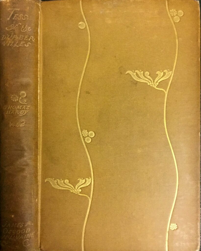
As the Vale Press books owe everything except the actual presswork to Mr. Ricketts, who is responsible for the type, the build of the page, the paper with its “Vale” watermark, the illustrations and decorations, and the bindings, it will be best to trace the evolution of these editions from earlier volumes which were only partially under his control.
Of these, the first number of The Dial is, I believe, the earliest; and the plan of this sumptuously – printed quarto reveals attention to those details of bookbuilding which later works develop more fully. The prospectus to announce The Dial, No. 1, and that to proclaim the advent of number 3, are delightfully original; indeed, with all respect for Mr. Ricketts’s latei aims, one can hardly restrain a certain amount of regret that the invention displayed in arranging ordinary types in well-balanced masses has been set aside for a stricter adherence to the canons laid down by the early Italian and other master bookbuilders of the past. The Dial, No. 1, appeared “from the Vale, Chelsea.” in 1889; No. 2 in February, 1892; No. 3 in October, in 1893; and No. 4, with the imprint “Hacon and Ricketts,” in 1896.
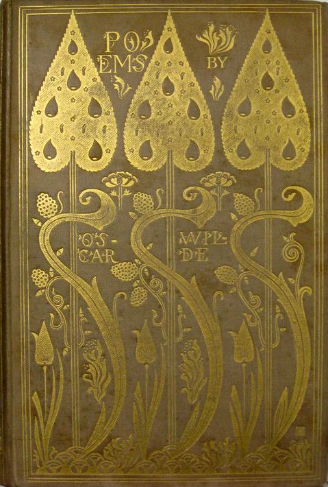
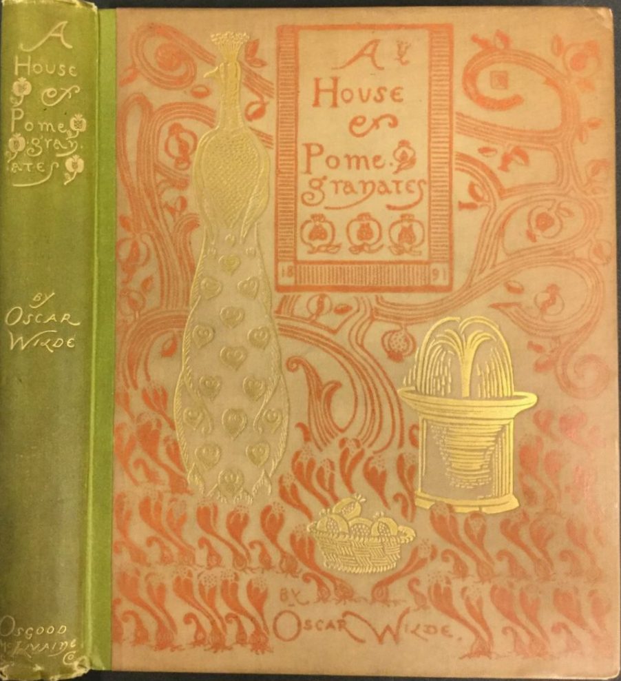
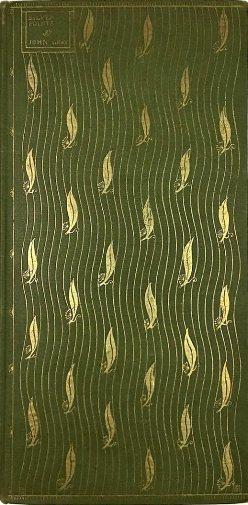
The earliest book produced under Mr. Ricketts’s entire control is Silver-Points (Lane, 1891) a tall thin octavo, which, in its dainty cover (designed by Mr. Charles H. Shannon), is a treasure to collectors and a continual joy to the lover of fine books. Several points in it, then entirely fresh in modern book-making, deserve mention. The poems are all in italic, except the initial letter of each line, which is Roman: the titles are in Roman capitals: the dedication in smaller-sized capitals, the whole packed tightly together, with margins that fulfil the established rule of the great printers — that is, narrowest on the inner side, the outer margin double the width of the inner, the top still more ample, and the lower wider still. Except that a simple decoration surrounds a few of the initials, there is not a spot of ornament in the whole book, which owes its beauty entirely to the arrangement of the type. In A House of Pomegranatetes (Osgood, Mcllvaine, 1891) — as the prospectus duly announced — “the design and decoration of the hook are by C. Ricketts and C.H. Shannon.” Here we find that the pictures are deliberately planned to decorate the page, and that certain roundel designs are dotted here and there on the margins for the same purpose. Other books, notably Grimm’s Fairy Tales, with Mr. Walter Crane’s designs, had long before attempted to bring the illustration to accord with the type-page; but, this is nearer the ideal, for the massing of the type itself seems to have been more thoroughly supervised by the artist. Lord Arthur Savile’s Crime (ditto) and The Bard of the Dimhovitza (ditto) also show- strong trace of Mr. Ricketts’s influence in their title-pages.
Two images from Daphnis and Chloe.
But these preliminary efforts must not, he dwelt upon. With Daphnis and Chloe, a quarto volume, we encounter what is said to be the first book published in recent times with woodcuts by the artist, in a page arranged by himself. It must not be forgotten that Mr. Ricketts is distinctly a revivalist of original engraving, never common at any period. Mr. W. J. Linton admits only two original woodengravers in the sixteenth century. One of the blocks reproduced here will convey an idea of the Daphnis and Chloe, which is modelled obviously on the Hypnerotomachia (Venice, 1499) and other books of that period. Not a few people have blamed Mr. Bicketts severely for his faithful adherence to the manner of the early Italians; and a few of these have at the same time approved equally faithful imitations of books of another race and time. The question is purely a matter of taste: but in choosing the Italians as models to follow, Mr. Ricketts stands alone at present. Not a little decorative bookmaking inspired by Teutonic and other early fashions has been put forth of far my inquiries have discovei which has been directly inspire Rappresentazioni.
Two unpublished blocks, both possibly for Cupid and Psyche. [Click on these images for larger pictures.]
Hero and Leander, issued in 1894, an octavo, is conceived in a different manner, and cannot be traced to the direct influence of any predecessor. The type of beauty which Mr. Ricketts adopts in its illustrations is not one that appeals to the lovers of the quaint or the pretty, who may be repelled by its severely archaic lines and the decorative intention which depicts a strangely fantastic ideal of humanity. To-day, when realism and imitation are dominant, the deliberate intention of an artist to make his subject express the idea he wishes to convey within a rigid convention, without binding himself to the canons of academic draughtsmanship, is apt tn be taken as treason. Bui those who are offended should remember thai a draughtsman of Mr. Ricketts’s ability does not err (if he err at all) through ignorance or carelessness. Emotion, passion, and the decorative pattern of his design sway him most; and to that end he evolves types of humanity which are not common, and proportions which do not agree with the record of the Kodak.
The Sphinx.
In The Sphinx (1894), a delicately wrought small-quarto, clad in white and gold, and printed in red, green, and black — the illustration-, are still more severe, and are certainly entirely remote from the direct influence of any work past or present. The artist, I believe, ranks this as one of his most satisfactory works; and, caviare though it must needs he to the average taste, its singular beauty needs no praise here. The absence of sensuousness in designs that are passionate in intention is peculiarly noticeable. But for the moment we may regard the illustrations of these three books as a side issue; except in one very important factor: the quality of their line, and the amount of white paper left untouched, which has been decided entirely with regard to position with the type. This is a point which Mr. Ricketts considers to be of the highest importance. It is the build of the page, the relation of the “colour” of the engravings to the type, and the symmetry of the whole volume, which he insists upon; and in these respects any person who has studied the beauty of a well-planned book cannot fail to be interested, even if the result is unlike his previously accepted ideal.
But all these volumes are only steps in the history of the Vale Press, and do nut represent the ideal which Mr. Ricketts wished in attain. In 1896 the results of long experiments wre made public, and the firm of Hacon and Ricketts was established. At present its publications are confined to books decorated, not illustrated; unless an occasional frontispiece entitles certain volumes to be so considered.
For these Mr. Llicketts designed a special type, and carried out an idea he had projected for a long time. The type has already been the theme of dispute, and has betrayed many hasty critics into rash statements. The possible innovations in a fount confessedly based on the precedent of the best Italian alphabets leave little room for violent novelty. One set of critics has objected to the style as too imitative; others have found it too novel. But no critic so far seems to have been sufficiently impressed by its fundamental idea. Mr. Ricketts believes that the plan on which all letters should be based is that of the perfect circle or the perfect square; it matters not which geometrical form you choose, since a certain number of letters — M, L, H, and the like — demand a parallelogram, and others — C, G, Q, — an ovate or circular plan. If to draw this distinction between types based mi the oval or the circle appear a mere quibble, we must remember that the difference between the Byzantine and Pointed style, which divide architecture into two great sections, is one of similar limit. There is all the difference in the world, to a specialist in types, between a small “b,” “g,” or “o” that follows the circle [O] and one that is planned upon an oval [0]. I wish to emphasise this point, because I know that the designer regards it as vital: and I, for one, agree entirely with bis estimate of its importance. The question of “serifs” and the angles of certain strokes: whether a W consists of interlaced Y’s, or of two connected only by the seriff; whether the serif’s of a capital T are vertical, or slant divers ways, or parallel — all these are secondary matters, but the plan of the letter is not secondary.
In the beautiful Kelmscott type, as in the famous Foulis founts and other notable instances, the O is ovate, and all other letters agree with it. In Mr. Ricketts’s “Vale” type the square and the circle dominate every letter. If this distinction be passed over as unimportant, further contention is useless. but on this point no compromise can be entertained. If it be unimportant whether the arch is a semicircle, or planned, like Euclid’s first problem, upon the intersection of circles, then it matters little. But so long as architecture is separated by such a structural difference, it follows that an based on a circle, or an H based on a perfect square, must be entirely unrelated to the ovate or the oblong H. When taste is in question, one allows the adversary equal vantage; but when geometry comes in, axioms must be observed. Therefore the ill-founded assertion that Mr. Ricketts’s type copies any modern fount cannot be allowed. You may dislike his symbol ha’ the ordinary “&,” or dispute over the beauty of his seriffs and the oblique strokes of certain letters: but if you maintain that a circle and an oval are practically alike, the question of these nicer points need not he raised.

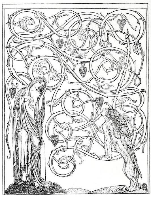
Initials and Culs-de-lampe for “Some Ancient Representations of Eros and Pysche” by Charles De Sousy Ricketts, 1866-1931. 1890. Magazine of Art (1896-97): 309. [Click on image to enlarge it.]
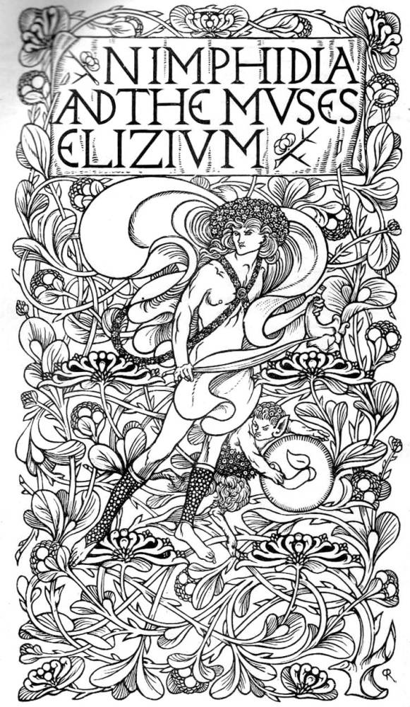
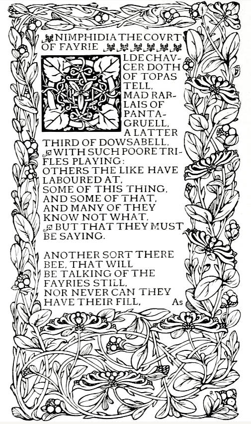
Two pages from The Nimphidia and the Muses’ Elizium. The one at right appeared in the article and the one at left in the 1890 Studio.
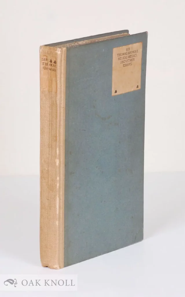
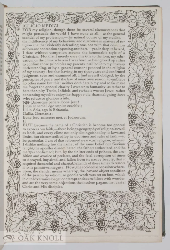
The Vale Press, with its own type, its own paper with its own watermark, has so far produced a comparatively small number of books; but a few months could hardly be expected to yield a hundred volumes. The output before the autumn holidays of 1896 comprises The Early Poems of Milton, The Poems of Sir John Suckling, The Nimphidia by Michael Drayton, Spiritual Poems by John Gray — all with frontispieces, borders, and initial letters, designed and cut on the wood by Charles Ricketts; also Epicurus, Leontine, and Ternissa, by W. S. Landor, with a border designed and cut by the same artist.
It would be easy to draw up a plea for the appreciation of this effort: but to do so, since a commercial enterprise is by the force of circumstances allied with an artistic experiment, would be to forsake a platonic attitude of disinterested appreciation, and descend to the puff oblique. As one who has had the privilege of seeing many of Mr. Eicketts’s experiments at early stages, I can unhesitatingly record his fervid anxiety to leave nothing undone that shall perfect his books according to the ideal he has developed. The aspect in which they concern us is the aesthetic result. The type is legible, the printing by Messrs. Ballautyne as good as one could wish, the paper and all the details which complete a volume show the uttermost care. Of the bindings nothing has been said, not only because Mr. Ricketts’s designs for cloth covers deserve a papei in themselves, but because they have been hitherto applied in boks not entirely under his control. The Vale editions (the Suckling excepted) are clad in seller paper boards, or white buckram, with simple labels. His effort deserves the sympathy of all interested in the applied arts: and if its ideal he net theirs, let them he quite sure first whether it is not even better; and if they satisfy themselves it is not, then one might ask why only one ideal of a beautiful hook is to be entertained.

Initials and Culs-de-lampe for “Some Ancient Representations of Eros and Pysche” by Charles De Sousy Ricketts, 1866-1931. 1890. Magazine of Art (1890): 309. [Click on image to enlarge it.]