24 x 15 cm. Octavo. 53 pages. 1 of 240 copies. Woodcut illustrations by Charles Ricketts. Patterned paper covered boards with apper title label to spine. Previous owner’s bookplate inside front cover. A previous owner has “markered out” the name which caused a light stain on the opposing page. Some uncut pages. Wear to the creases and edges of the spine. Seller Inventory # 55458
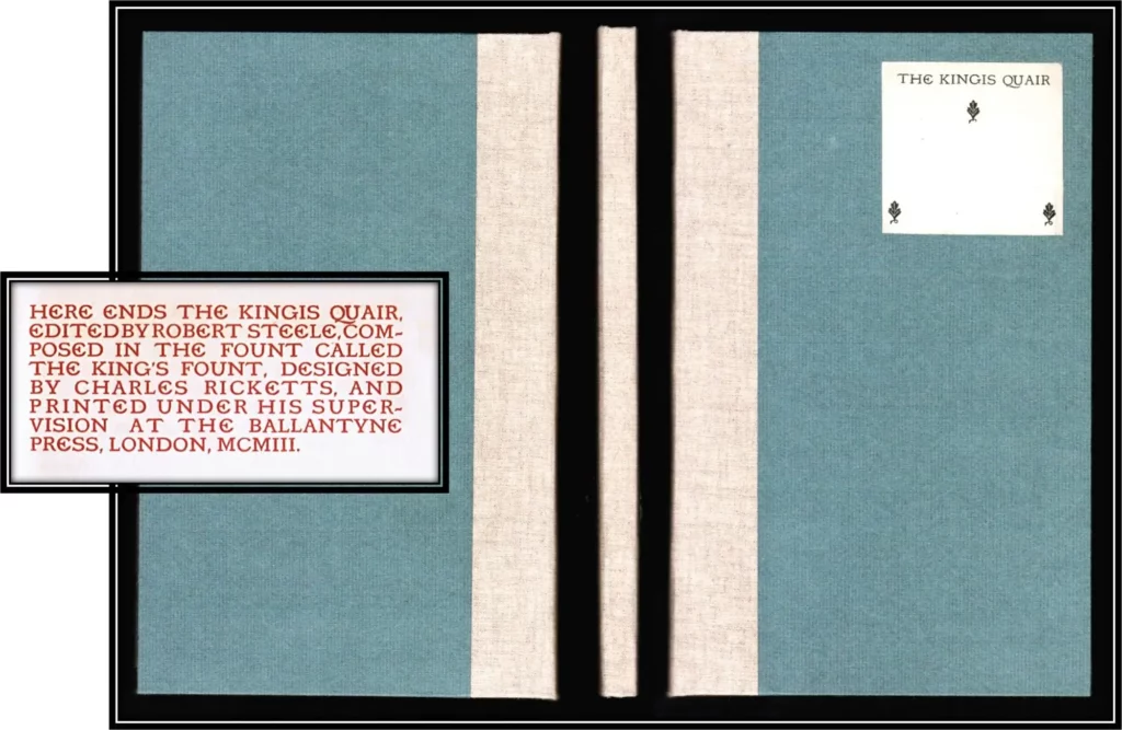
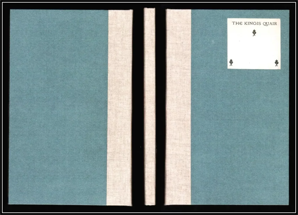
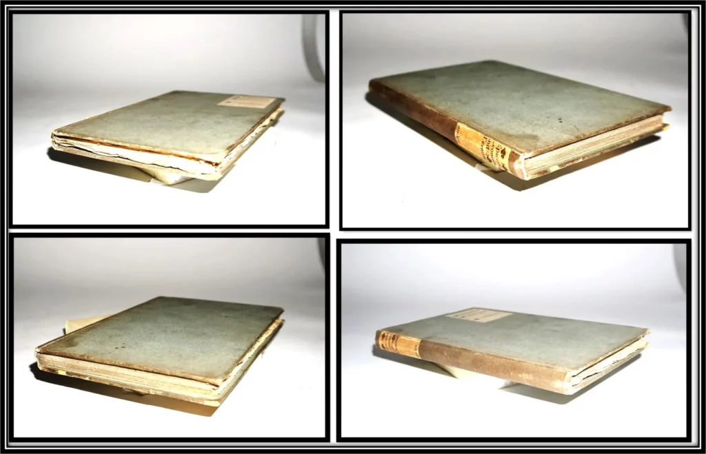
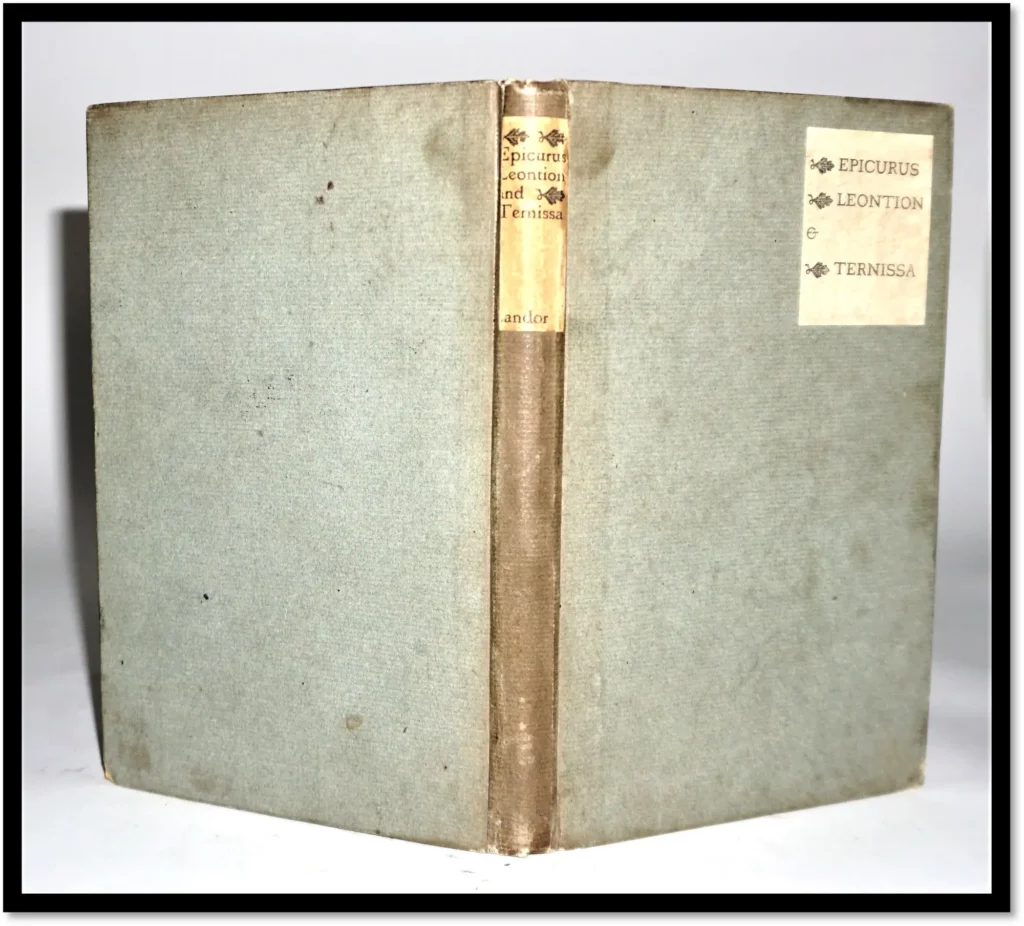
Rebound to match original Quarter linen. Blue paper boards. Original Printed label on the front cover in the Kings Fount. No Flaws or Blemishes but minimal handling; text clean and bright with only a hint of age-toning on the text block edges. The label has the slightest darkening on the top edge.
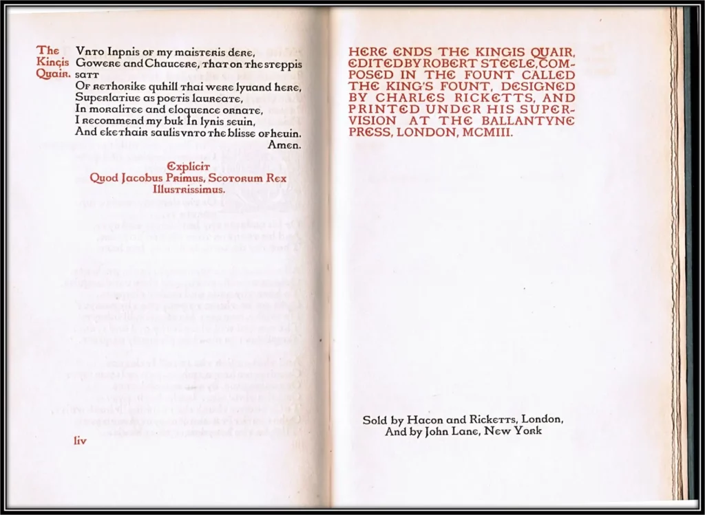
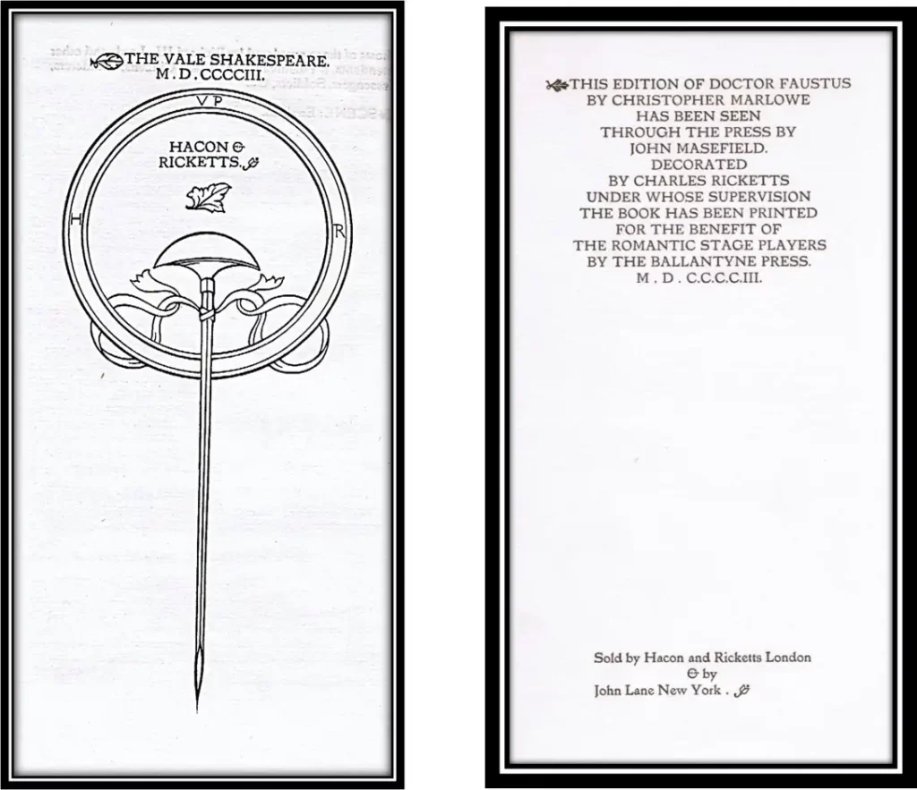
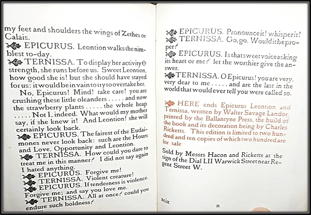
8vo; 9.25 inches tall; pp. i-iv v-liv lv-lvi; 28 leaves; 6 blank leaves of the same paper. Designed by Charles Ricketts and printed under his supervision. One of 260 copies on paper. Sold by Hacon and Ricketts, London and John Lane, New York. Composed in the Fount called The King’s Fount; Printed in red and black.
Comparatively uncommon with only 5 copies listed in universities or institutions plus 2 more recorded in Watry. [oclc]
Fine / No Jacket. Item #014275
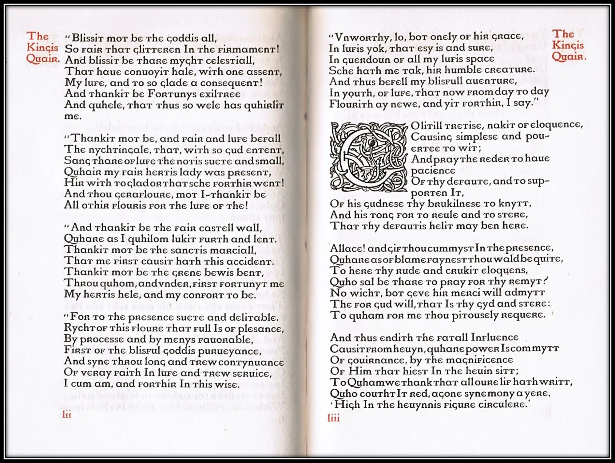
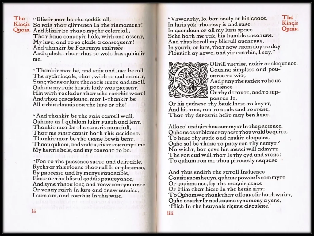
The Kingis Quair is a poem of clear Chaucerian descent, written in the same seven-line stanzas as Trailus and Criseyde, that marks the beginning of a Chaucerian movement in the literature of Scotland.
The poem exists in only one manuscript, MS Arch. Selden B. 24 of the Bodleian Library at Oxford University, where it is twice attributed to King James I of Scotland (1424-1437).
Indeed, it is due to the connection with James that the particular seven-line stanza format in which the poem is written is now known as ‘rhyme royal.’
Rickett’s prefaced this edition with quotations taken from Rossetti’s historical ballad ‘The Kings Tradgedy’.
Richett’s arranged to have the Vale Press publications printed at the Ballantyne Press as private press books by a carefully chosen selection of compositors, readers, pressmen and binders freed from the everyday demands of the press. [Watry]
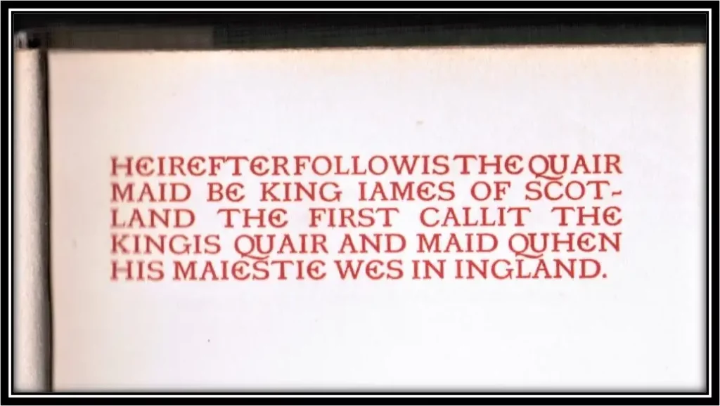
[Full Title]:Heirefter followis the quair maid be King Iames of Scotland the First callit The kingis quair and maid quhen His Maiestie was in Ingland
quarter cloth over blue paper covered boards, paper label on cover
74 pages.
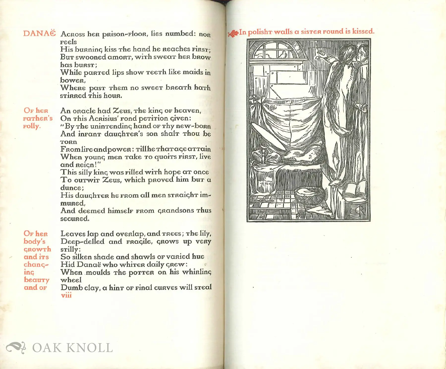
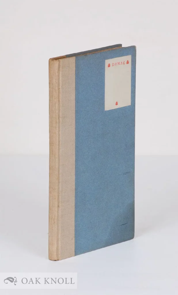
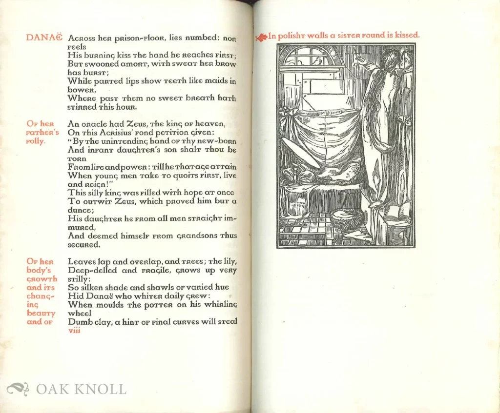
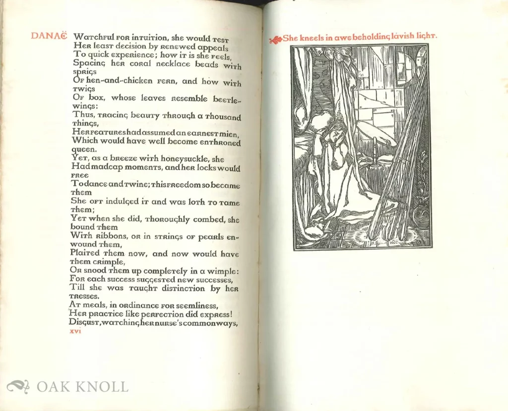
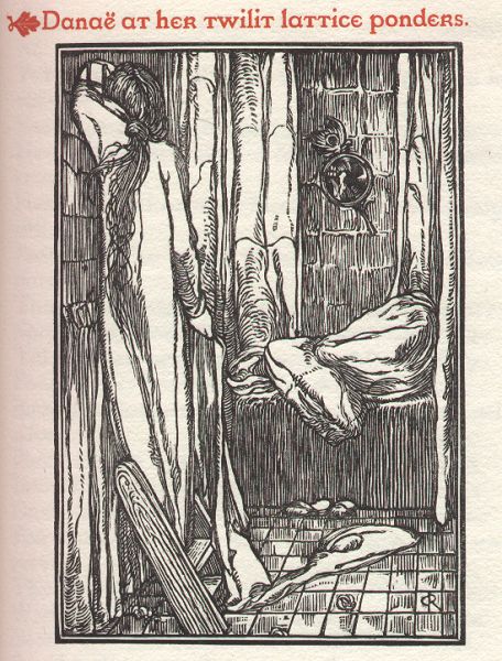
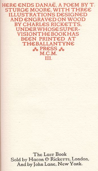
Printed in red & black by the Ballantyne Press on handmade paper. (BIBLIOGRAPHY OF THE BOOKS ISSUED BY HACON & RICKETTS, pg xxxi). Three wood block illustrations. Some very light discoloration to blue holland boards, with light discoloration to pastedowns and endpapers. Else an excellent copy. Unopened. “Danae was the last book published by Hacon and Ricketts and contains 3 illustrations by Charles Ricketts. While many of the Vale Press books contained decorative title page borders and initial letters by Ricketts, very few of them had illustrations.” Extremely scarce.
BIBLIOGRAPHY OF THE BOOKS ISSUED BY HACON & RICKETTS: Danaë. A Poem by T. Sturge Moore. With three illustrations designed and cut on the wood by Charles Ricketts. Demy octavo. Two hundred and thirty copies printed in the King’s fout in red and black. Price twenty shillings. Ten copies printed on vellum. The shoulder notes and colophon are printed in red and the statement made in the colophon that it is the lat book published by Hacon and Ricketts..
Danae was the last book published by Hacon and Ricketts and contains 3 illustrations by Charles Ricketts. While many of the Vale Press books contained decorative title page borders and initial letters by Ricketts, very few of them had illustrations.
This book was printed in the Kings font which was Ricketts’ personal favorite. Like William Morris of the Kelmscott press before him and T. J. Cobsen-Sanderson of the Doves Press after him, Ricketts designed his own fonts and had them cut by Edward Prince. In addition to the fonts of the Kelmscott, Doves, and Vale Presses, Prince also cut the Brook font for the Eragny press, the Endeavor font for Essex House, and the Subiaco type for Ashendene. Three different fonts were used in the Vale Press books. The first and best known was the Vale type. The second was actually a smaller version of the Vale type and was called the Avon type since it was used in the 39 volume Shakespeare’s Works. The Kings font was the third and last used by the Vale Press. After a final bibliography of the press in 1904 (the only item printed after this book), Ricketts tossed all his type and the matrices used for casting the type into the river Thames (over a decade later T. J. Cobden-Sanderson did the same with the Doves type).
London: Vale & Ballantyne Press For Hacon and Ricketts, 1903. Illustrated by Charles Ricketts (1866-1931). Limited Edition. A Very Good Hardcover.
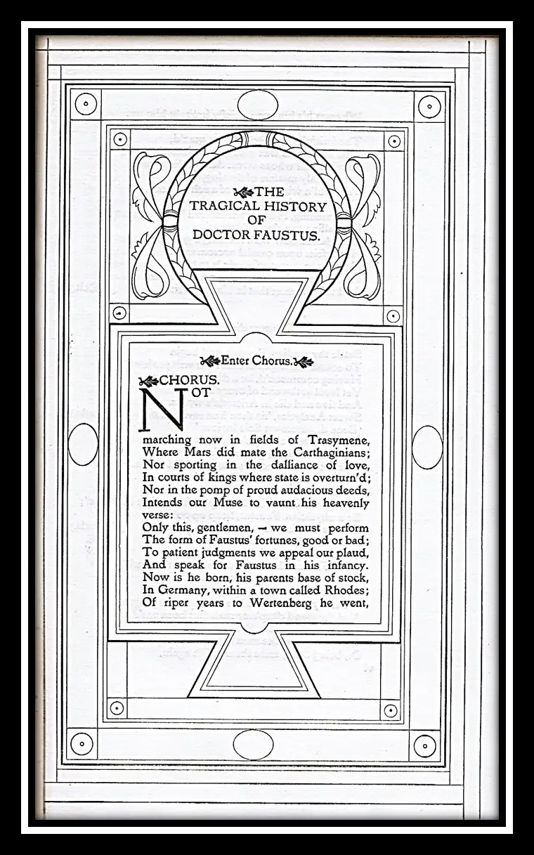
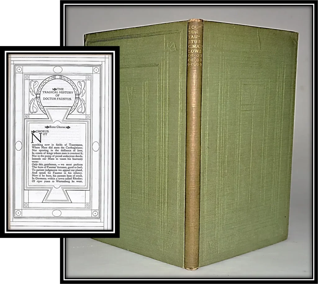
This play was produced to benefit The Romantic Stage Players, a group of amateur performers led by Thomas Sturge Moore, Lawrence Binyon and W. B. Yeats. Sold by Hacon & Ricketts. Limited to 310 copies. Designed by Charles Ricketts (1866-1931). Seen through the press by John Masefield.
Green cloth with blind-stamped geometric design; Gilt stamped spine title. Printed in the Avon Type on lighter paper with the Mermaid watermark; Printed in a uniform manner as the Press’s Shakespeare using the border from the Tragedies.
The bindings are tight and square. Text clean, light even toning. Moderate shelf handling wear. Spine has age-darkening with Free endpages toned as is typical. Preliminary leaves unopened. 8vo; 9.5 inches tall; (12) blank, li, (1) blank, colophon, (13) blank.
Very Good / No Dust Jacket As Issued. Item #014366
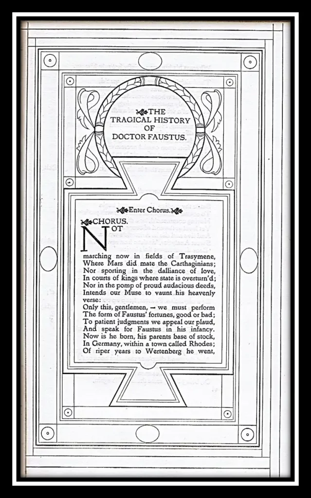
The Tragical History of the Life and Death of Doctor Faustus, commonly referred to simply as Doctor Faustus, is an Elizabethan tragedy by Christopher Marlowe, based on German stories about the title character Faust. It was probably written in 1592 or 1593, shortly before Marlowe’s death.
“From the corner of the divan of Persian saddle-bags on which he was lying, smoking, as was his custom, innumerable cigarettes, Lord Henry Wotton could just catch the gleam of the honey-sweet and honey-coloured blossoms of a laburnum, whose tremulous branches seemed hardly able to bear the burden of a beauty so flamelike as theirs; and now and then the fantastic shadows of birds in flight flitted across the long tussore-silk curtains that were stretched in front of the huge window, producing a kind of momentary Japanese effect, and making him think of those pallid, jade-faced painters of Tokyo who, through the medium of an art that is necessarily immobile, seek to convey the sense of swiftness and motion.” – Chapter 1, The Picture of Dorian Gray, Oscar Wilde
Ricketts stated that the unusual and influential design of the book was in the style of an Aldine italic volume and a Persian saddle-book. 25 numbered …
London: Vale & Ballantyne Press For Hacon and Ricketts, 1896. Topography by Charles Ricketts (1866-1931). Limited Edition of 210. Hardcover.
Limited to 210 copies, 200 for sale; The Second book published by the Vale Press in the same month as Milton.
Sold by Hacon and Ricketts. Printed at the Ballantyne Press ‘where a handpress and pressman were reserved exclusively for Rickett’s use under his own personal supervision’ [Cave]
Frontispiece, border and initial letters designed and cut on wood by Charles Ricketts. The border was not used again, and the firm mark was afterwards recut. Ricketts took the liberty of ‘adding the flower and stems of the violet to the traditional 16th century strap and knotwork motifs.
Blue paper boards, printed labels on upper corner and spine. Printed in Vale type in black and red on laid-paper watermarked, Unbleached Arnold paper. The bindings are tight and square. Text clean, light even toning. Shelf handling wear with a darkened spine; small rubs on the front top and bottom corners; free endpages, as typical are toned; Some hand-soiling.
Very Good / No Dust Jacket As Issued. Item #17057
The Second book published by the Vale Press in the same month as Milton.
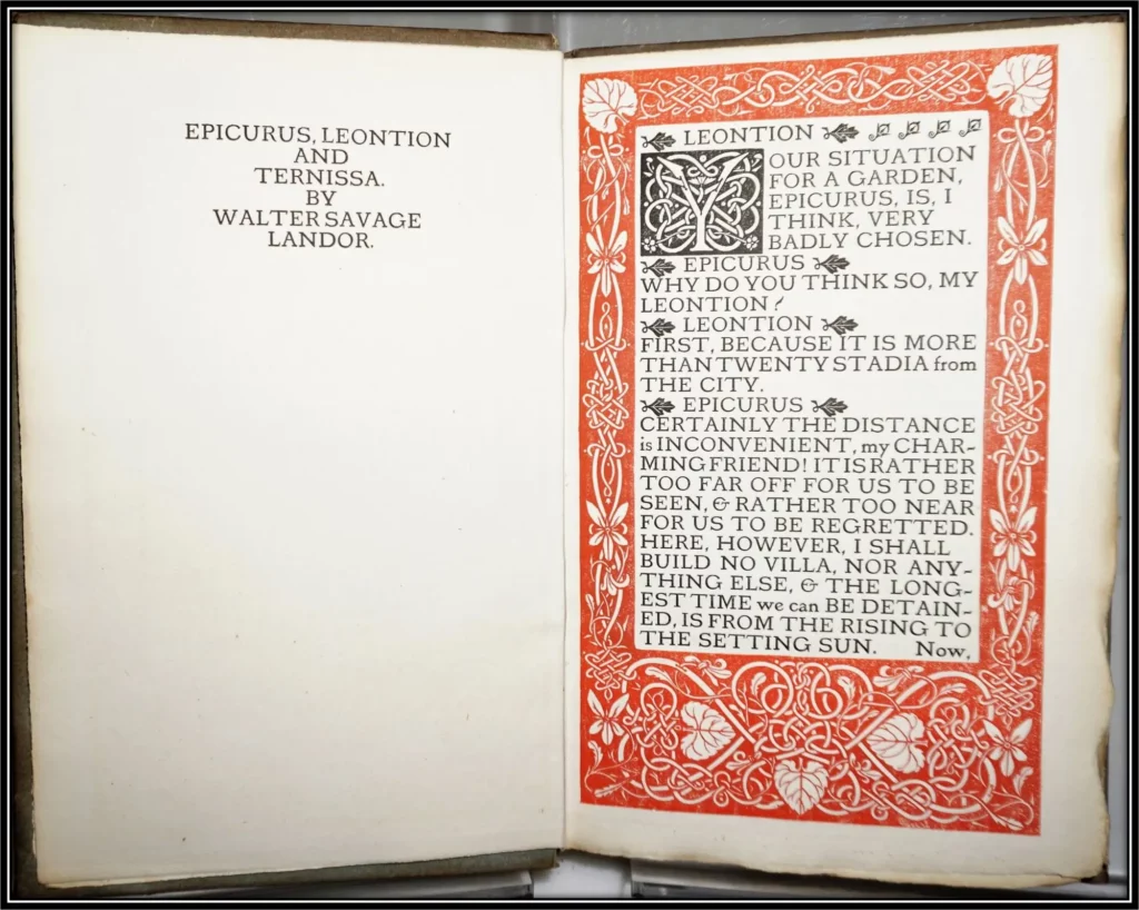
Landor’s ‘Imaginary Conversation’ was first printed in 1829. As a poet, Walter Savage Landor was best known for his classic epigrams and idylls. He was a seriously emulative classicist and wrote a significant proportion of his poetry in Latin, which was also the original language of some of the long and short poems that he published in English.
Background Information: Robert Pinsky has characterized Landor’s poetry as distinguished above all by an urbane awareness of rhetorical and stylistic convention-“a voice more resonant than any particular moment of history.”
The “Saturday Review” (July,1896) noted ‘The workmanship and design of the border’ were ‘beyond praise’ concluding that ‘it was of the most perfect books of its size ever published’.
Hugh Whitemeyer has described Landor’s contribution to Pound’s cultural ventriloquism and to his sympathetic conception of the artist figure in isolation, a persona of dedicated unpopularity and expatriation. Pound’s particular interest in Landor’s poetic style, seeing him as a master of the “hardness” effected by minute control of emotion and technical detail, has stimulated the attention of several poet-critics to Landor’s play with conventional language.