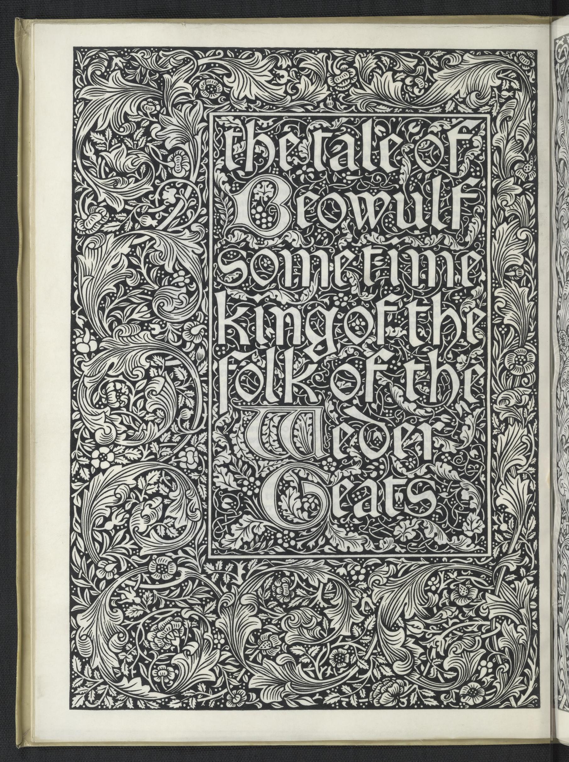
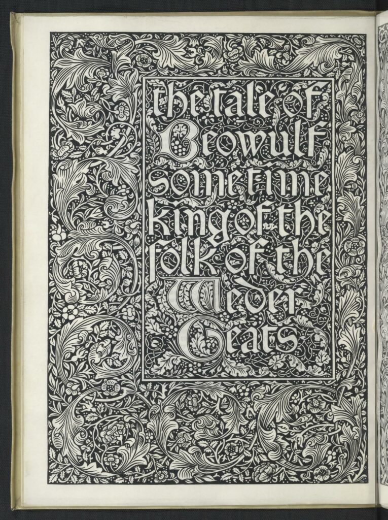
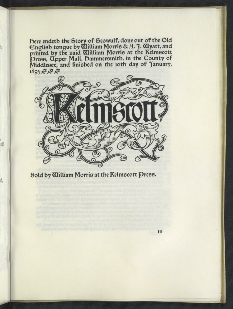
Bibliography: “Done out of teh Old English tongue by William Morris and A. J. Wyatt. Large 4to. Troy type, with argument, side-notes, list of persons and places, and glossary in Chaucer type. In black and red. Borders 14a and 14, and woodcute title. 300 on paper at two guineas, 8 on vellum at ten pounds. Dated Jan. 10, issued Feb. 2, 1895. Published by William Morris. Bound in limp vellum. The borders in teh book were only used once again, in the Jason. A Note to the Reader printed on a slip in teh Golden type was inserted in each copy. Beowulf was first announced as in preparation in the list of May 20, 1893. The verse translation was begun by Mr. Morris, with the aid of Mr Wyatt’s careful paraphrase of the text, on Feb. 21, 1893, and finished on April 10, 1894, but the argument was not written by Mr. Morris until Dec. 10, 1894.” (39-40)
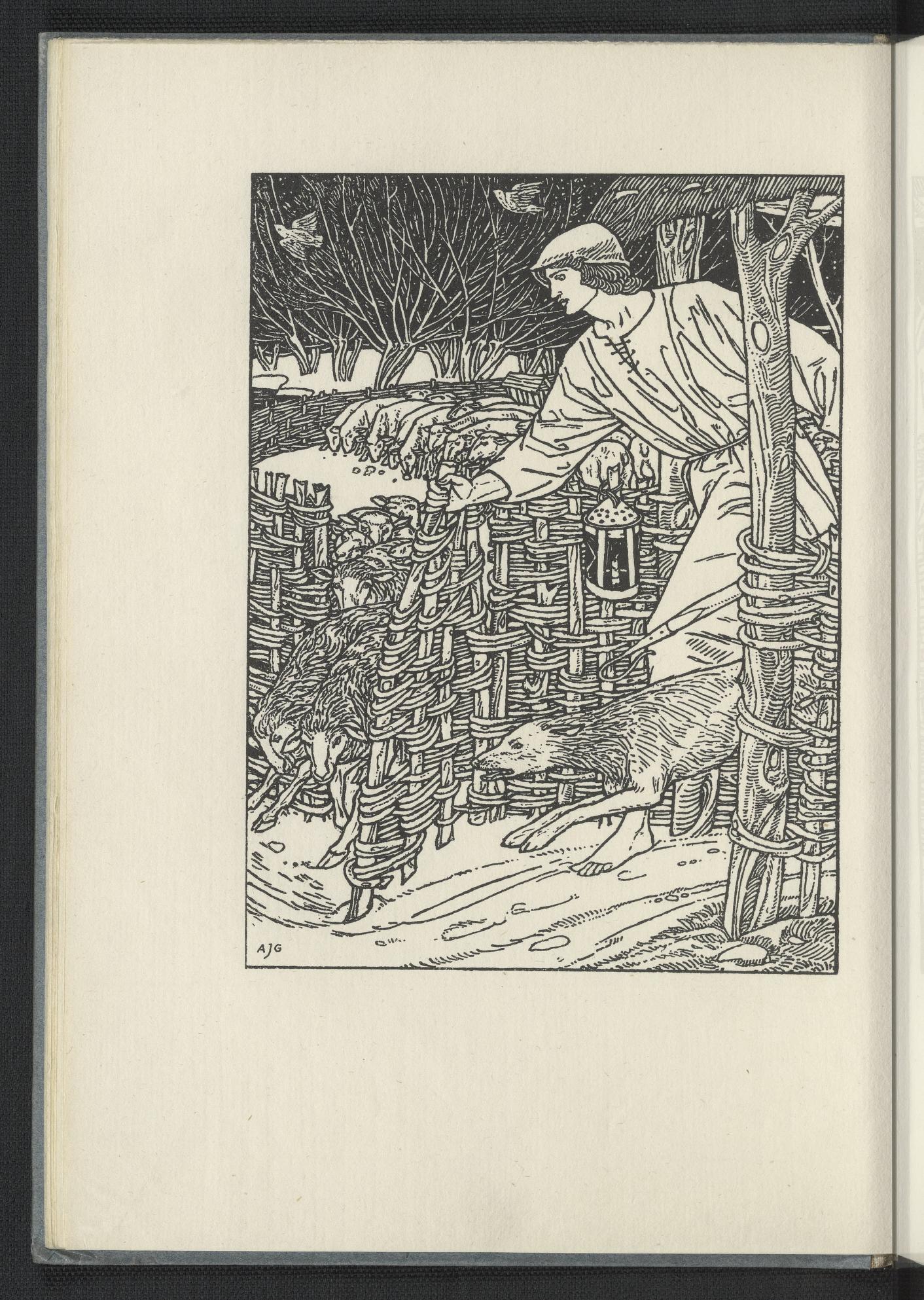
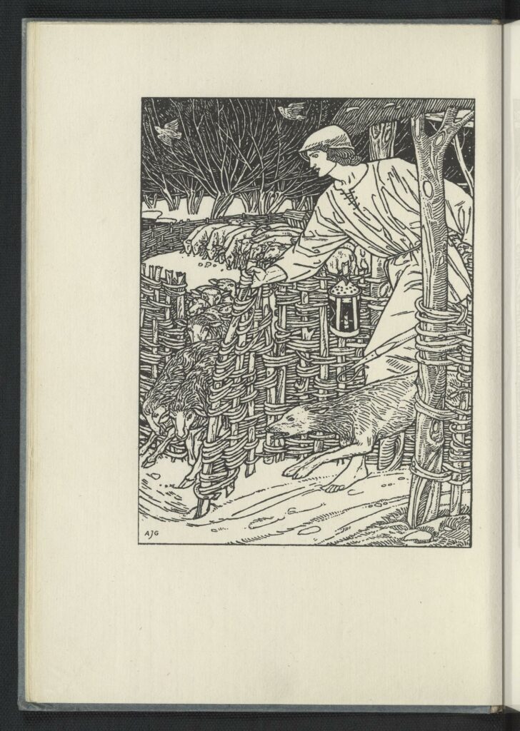
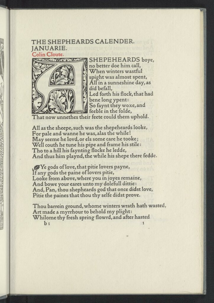
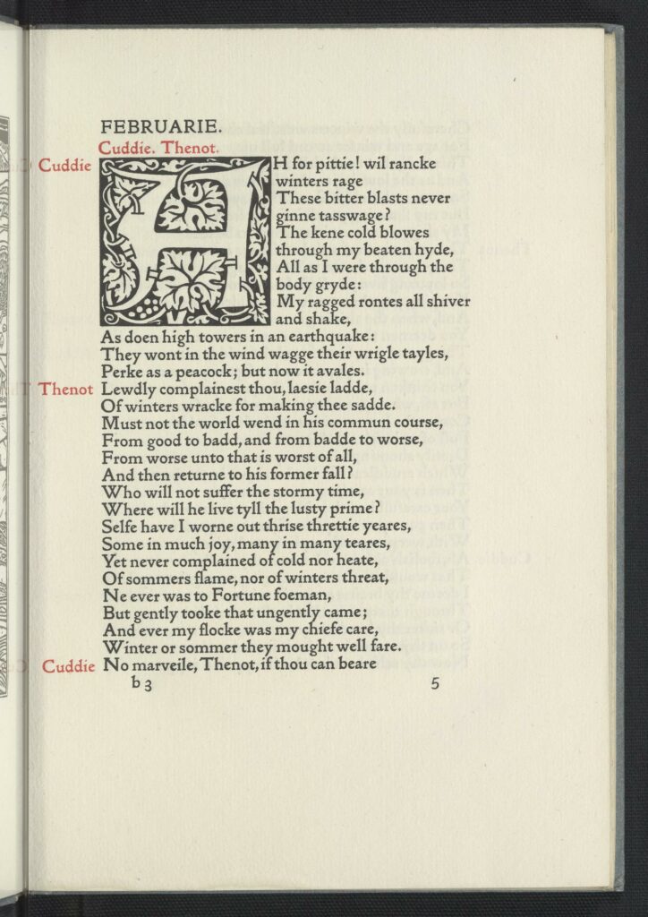
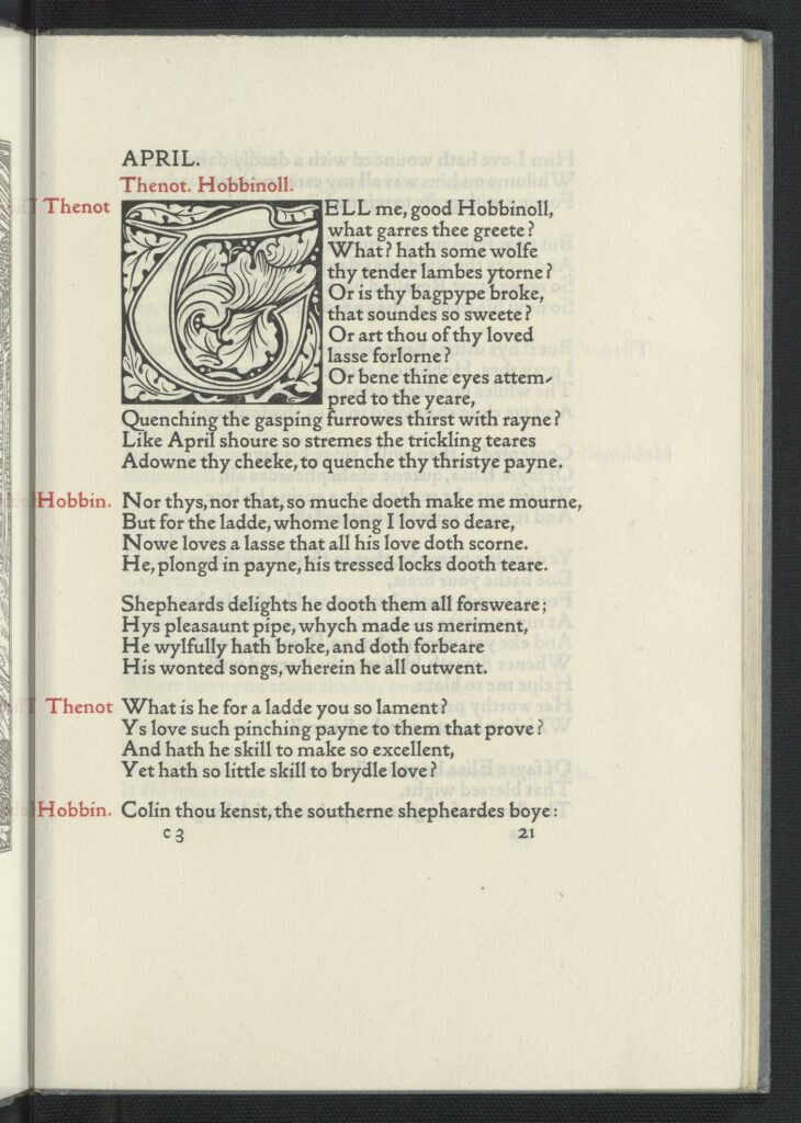
Written by Edmund Spenser; illustrated by Arthur Gaskin; edited by F.S. Ellis.
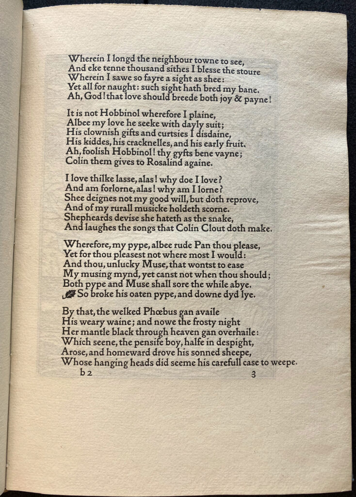
Bibliography: The Shepheardes Calender: Conteyning Twelve Aeglogues, Propotionable to the Twelve Monethes. By Edumund Spenser. Edited by F.S. Ellis. Medium 4to. Golden type. In black & red. With twleve full-page illustrations by A. J. Gaskin. 225 on paper at a guinea, 6 on vellum at three guineas. Dated Oct. 14, issued Nov. 26, 1896. Published at the Kelmscott Press. Bound in half holland. The illustrations in this book were printed from process blocks by Walker & Boutall. By and oversight the names of the author, editor, and artist were omitted from the colophon.” (50)
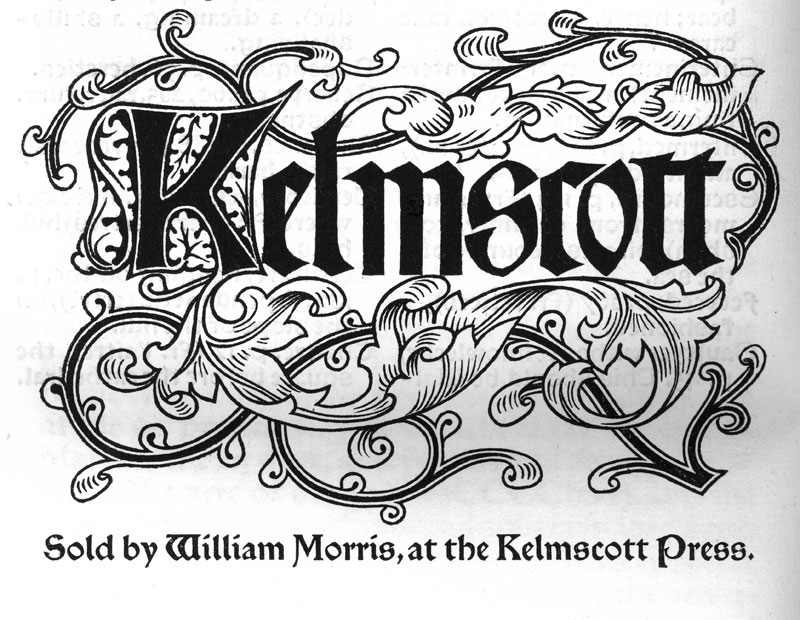
William Morris’s printers mark, this appeared in nearly all of the books published at Kelmscott
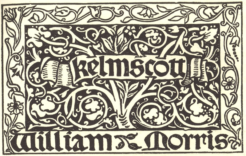
A later printers mark, used on large folio format books
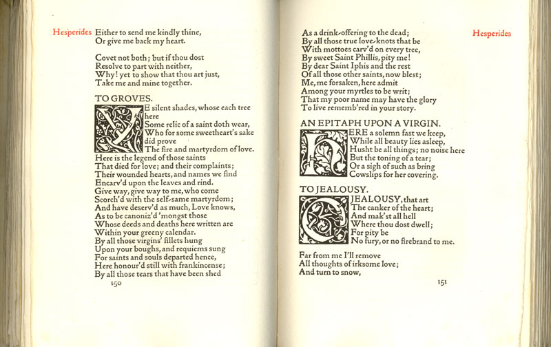
A spread from ‘Poems Chosen out of the Works of Robert Herrick
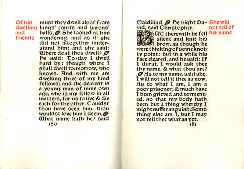
A spread from ‘Child Christopher and Goldilind the Fair’, Kelmscott Press, 1895
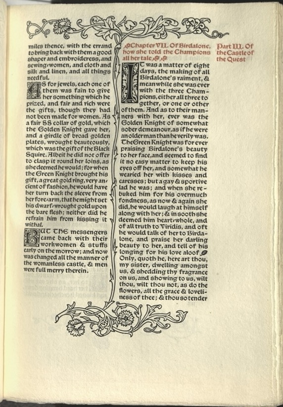
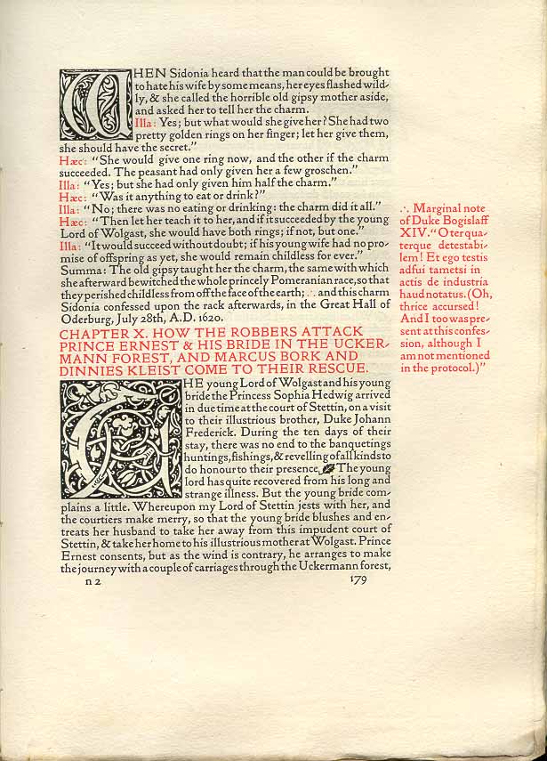
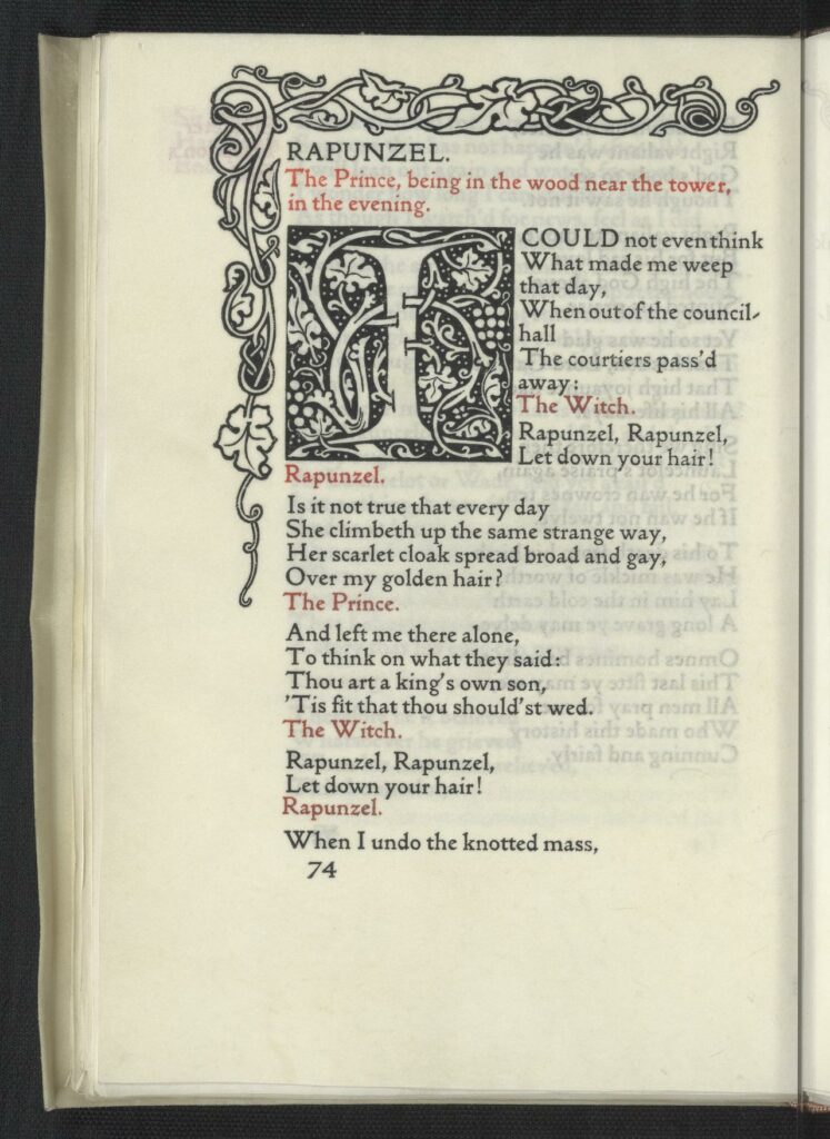
An instance where red is used to provide emphasis on words in the text, instead of only for subtitles and headings
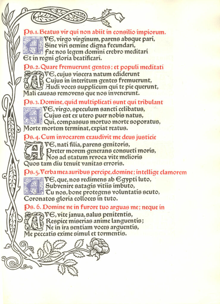
A page from ‘Laudes Beatae Mariae Virginis’ – which is very rare among Morris’s works that is uses blue ink in addition to the typical black and red.
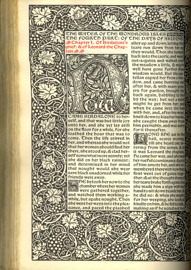
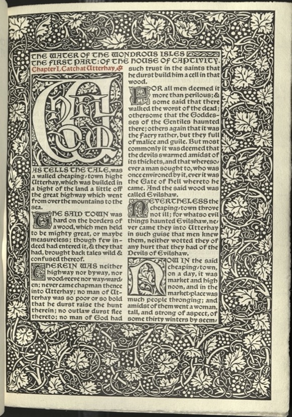
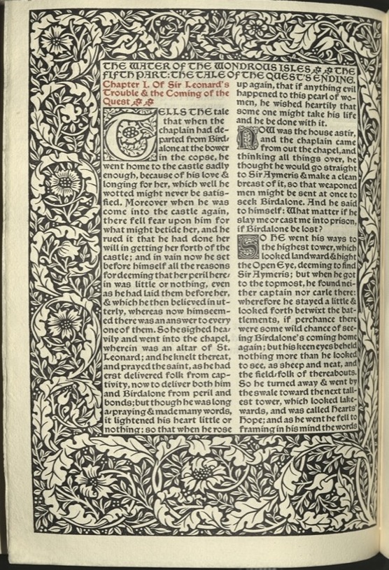
The first page of the Waters of the Wondrous Isles’
A title page from ‘The Boke of Cupid’ with an exceptionaly large illuminated word – ‘the’
The cover of ‘Art and its Producers, and the Arts & Crafts of Today: Two Addresses Delivered Before the National Association for the Advancement of Art. By William Morris
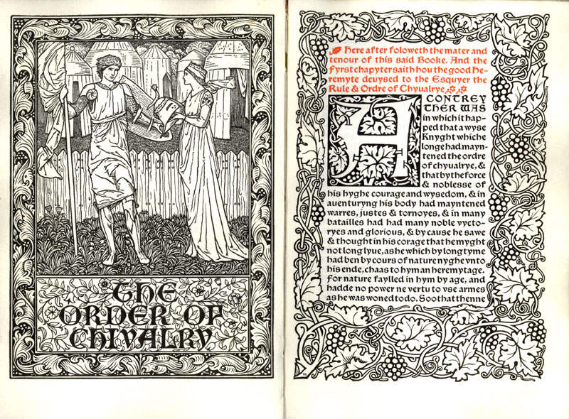
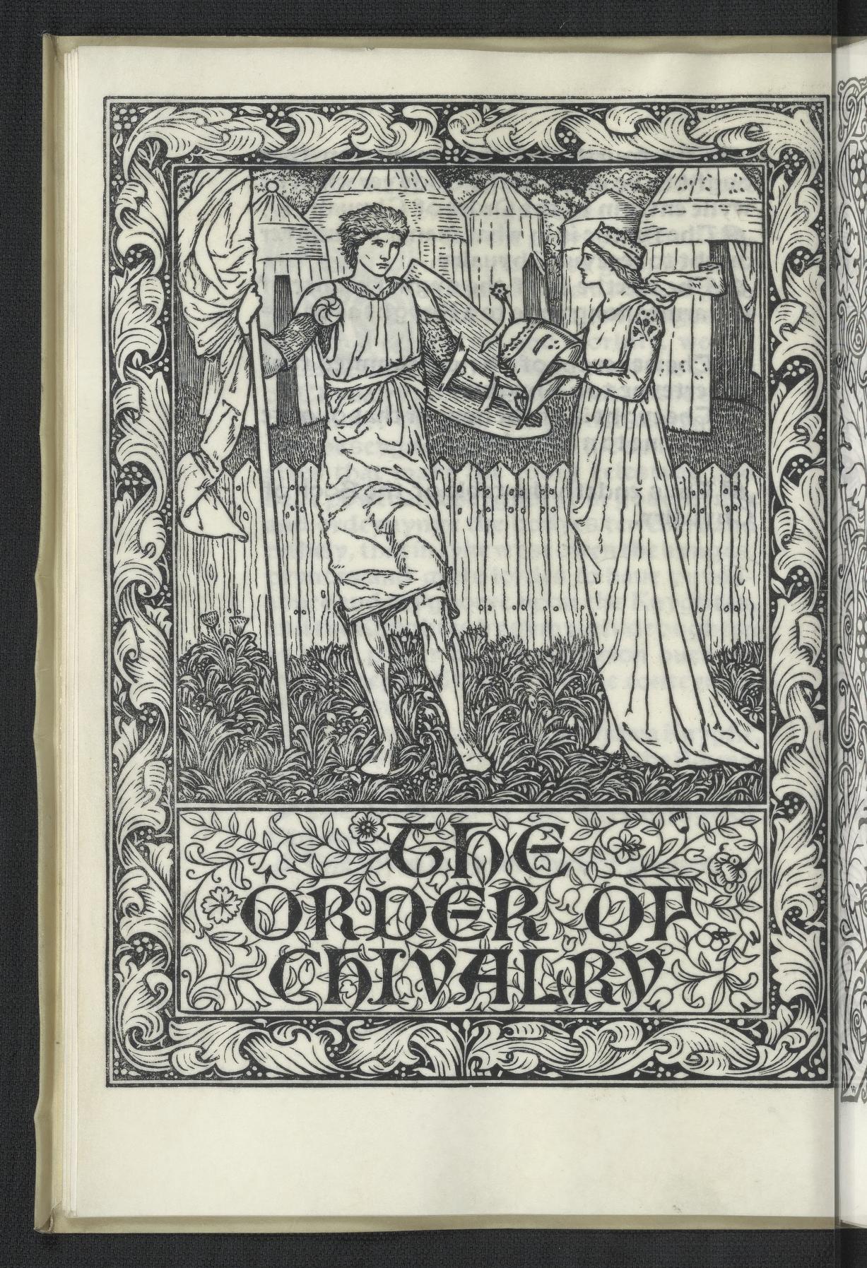
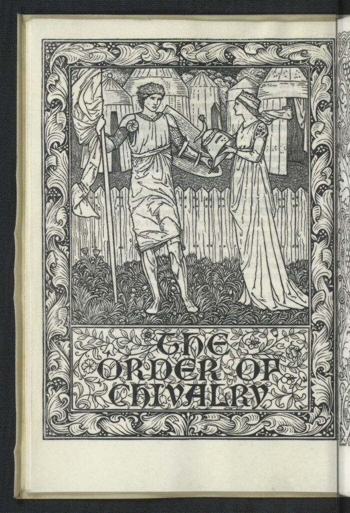
The title spread of ‘The Order of Chivalry’, printed on vellum
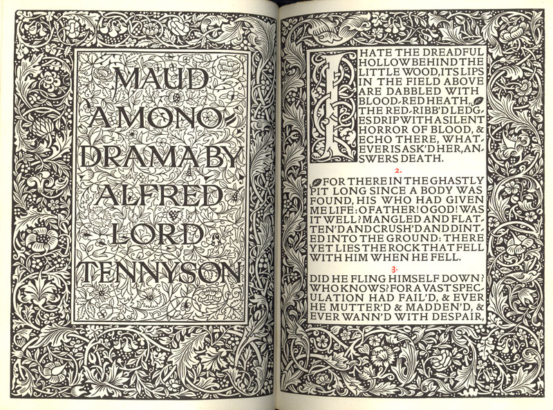
The title page spread from Alfred Lord Tennyson’s ‘Maud’
This was the last book printed at the Kelmscott Press, and was sold by the trustees of William Morris
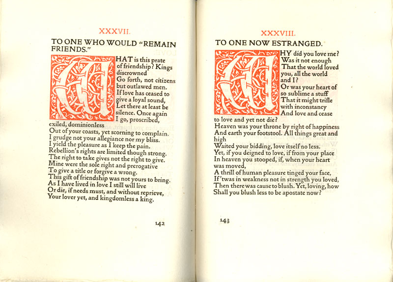
Two poems from ‘The Love-Lyrics and Songs of Proteus’. This layout is rare because it uses red illuminates characters
Typographic samples of the three fonts William Morris designed and used at Kelmscott
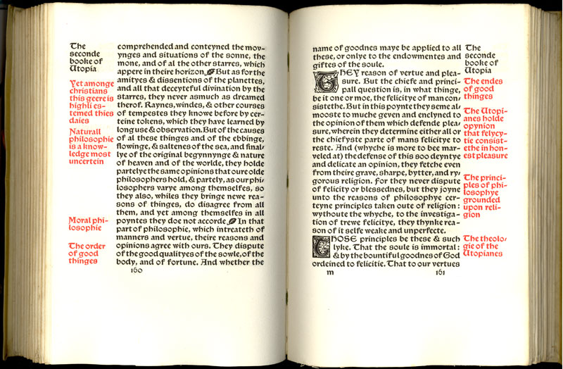
A spread from More’s ‘Utopia’. In this case the red margin notes summarize the corresponding text
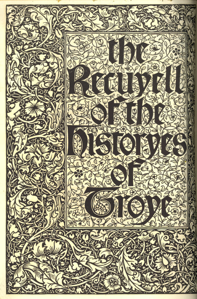
Title page from ‘The Recuyell of the Histories of Troye’
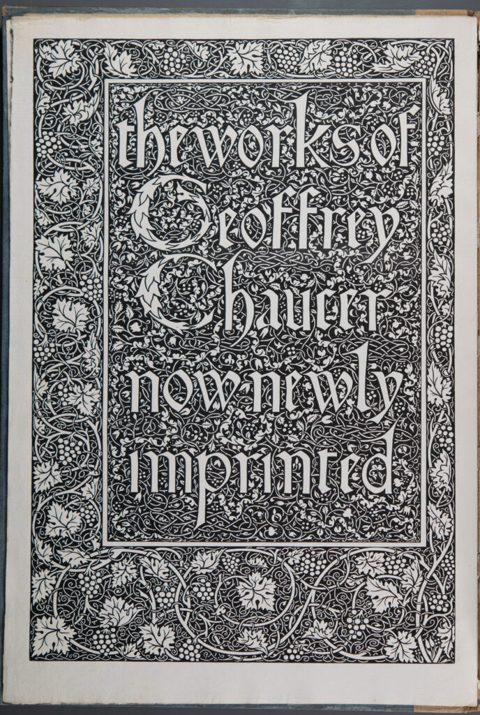
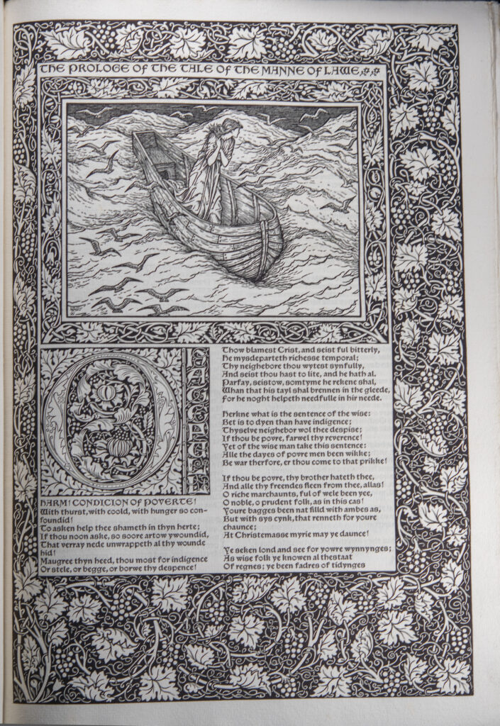
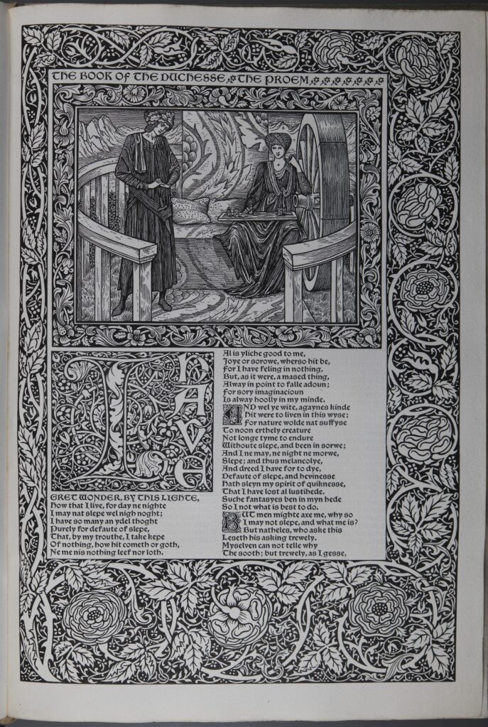
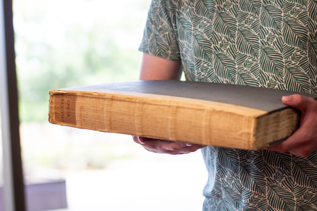
Works of Geoffrey Chaucer, Mann of Lawe , SPEC B-737
Works of Geoffrey Chaucer, 385, SPEC B-737
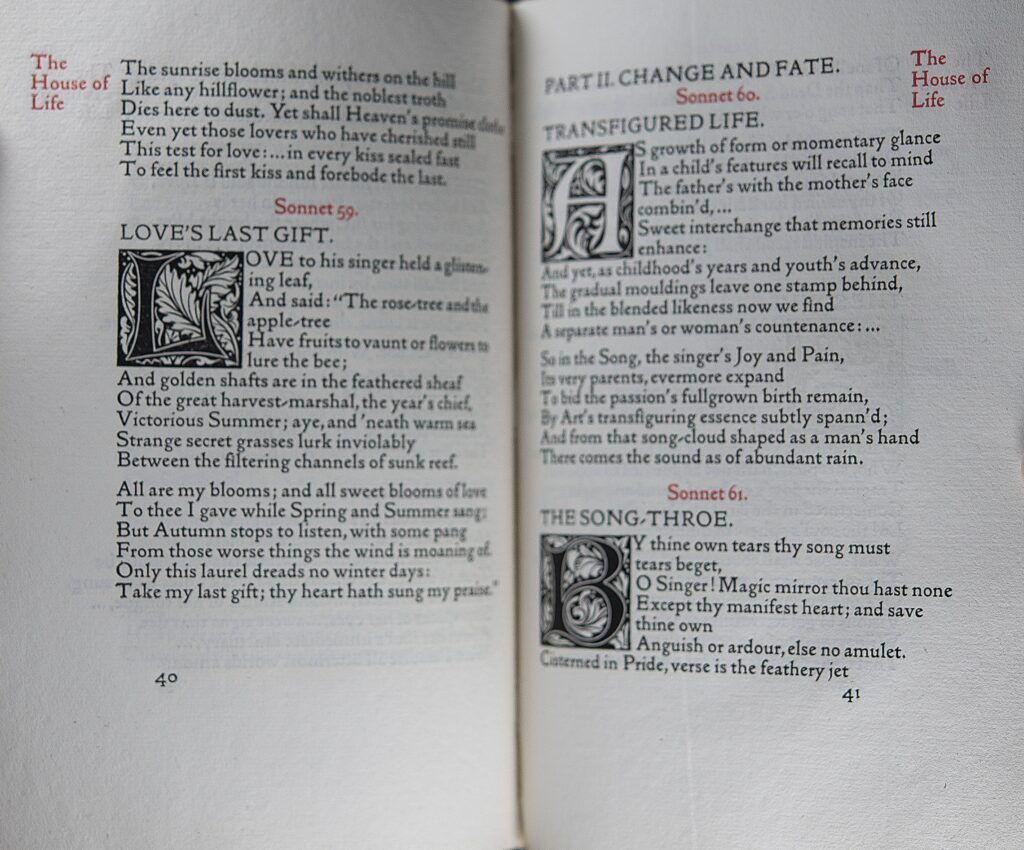
Works of Geoffrey Chaucer, 60, SPEC B-737
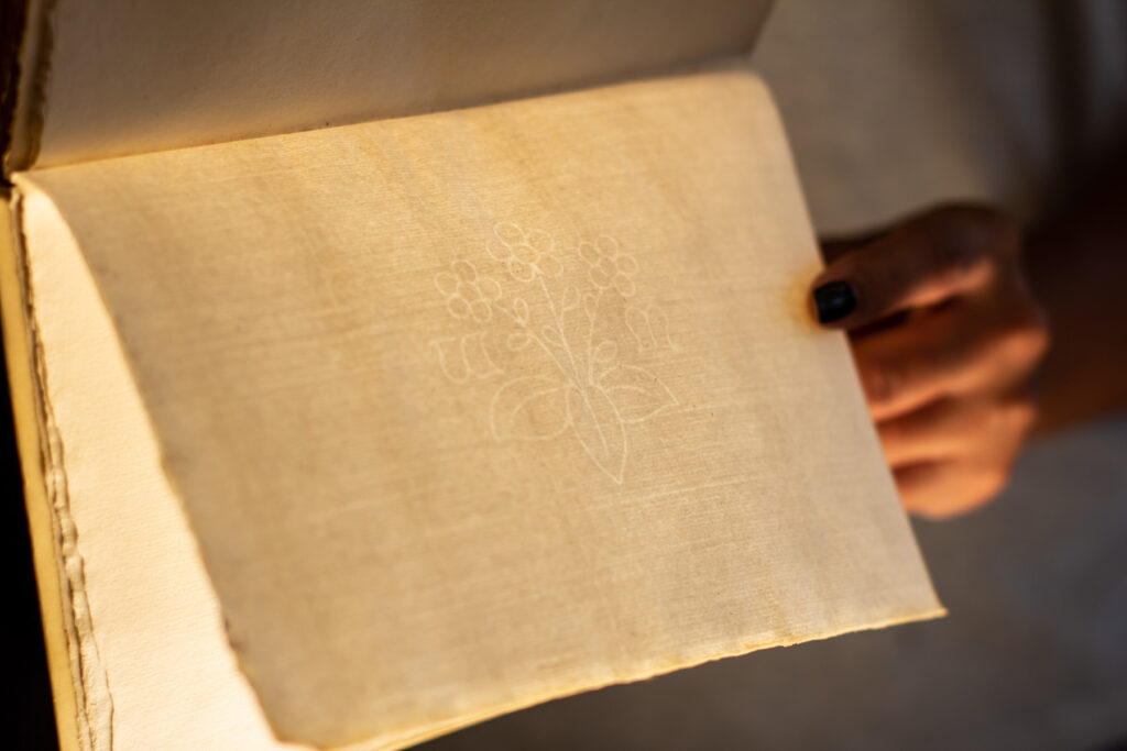
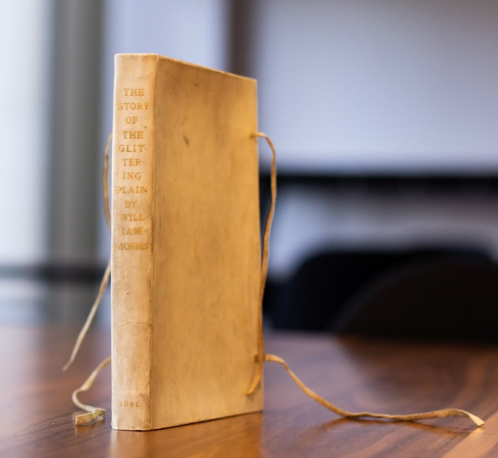
Flower, Glittering Plain, PRB-463
Apple, Story of Sigurd the Volsung, PRBF-41
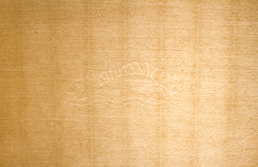
Perch, Works of Geoffrey Chaucer, SPEC B-737
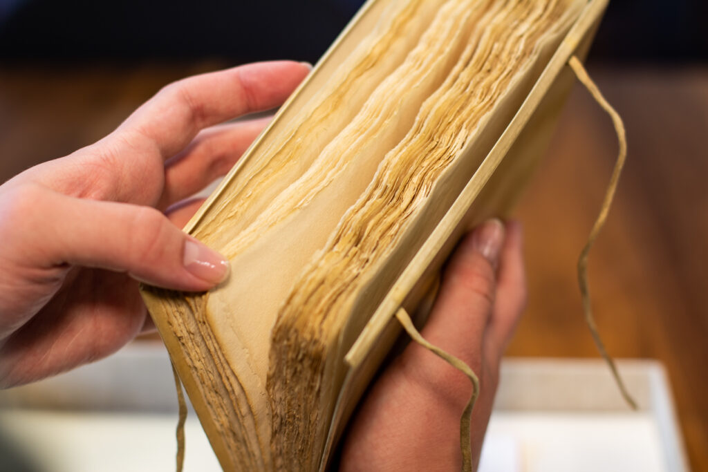
Most Kelmscott Press books were printed on handmade paper produced by Joseph Batchelor and Son in Kent. Morris specified that the paper had to be made of linen rags. In his note about the founding of Kelmscott Press, Morris also specified that a mould must be used, which would produce a ribbed appearance similar to the paper he had identified as his model, paper produced in Bologna around 1473.
Morris also printed a limited number of copies of each publication on vellum. He sought high-quality, Italian vellum, but because he was competing with the Vatican for that supply, he found locally produced vellum that met his standards, produced by Henry Band and William J. Turney & Company.
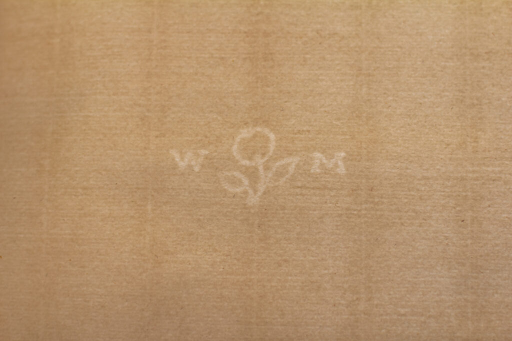
Another feature of the papers used for the Kelmscott Press books were watermarks. Morris designed three watermarks–a flower (primrose), perch, and apple. The flower appear in 16″ x 11″ and 16″ x 22″ paper; the perch in 17″ x 23″ paper; and the apple watermark in 18″ X 13″ paper.
Golden typeface, Shepheardes Calendar, PRB-506
According to Morris, he began with a Roman type. He considered the letters to be pure in form and free of “needless excrescences.” His inspiration for his “Golden” typeface (left) was the French engraver, Nicholas Jensen, who worked in Venice and designed the most complete set of Roman font
Troy typeface, Floure and the Leafe, PRB-505
Chaucer typeface, Sir Degrevaunt, PRB-508
Morris then developed a Gothic typeface that was as easy to read as Roman type. This was his “Troy” typeface, but as he undertook the work for his Chaucer, he needed a smaller version to accommodate the double-column format. To fill this need, he designed the aptly named “Chaucer” typeface.
In addition to having well-designed, easy-to-read typefaces, the color of the text when printed was important to Morris. He disliked that many Victorian publications looked grey due to the cheap ink used. To avoid this, Morris sought a very black ink and found one produced by Gebrüder Jänecke in Hanover, Germany.
Having selected paper, typefaces, and ink, Morris and the Kelmscott Press used Albion hand presses to print their publications. Kelmscott’s Chaucer posed particular challenges due to its size so Morris acquired a third Albion press, an Albion Press no. 6551. The Floor Model Albion Press No. 6551 Morris used now resides at in the Cary Graphic Arts Collections at the Rochester Institute of Technology.
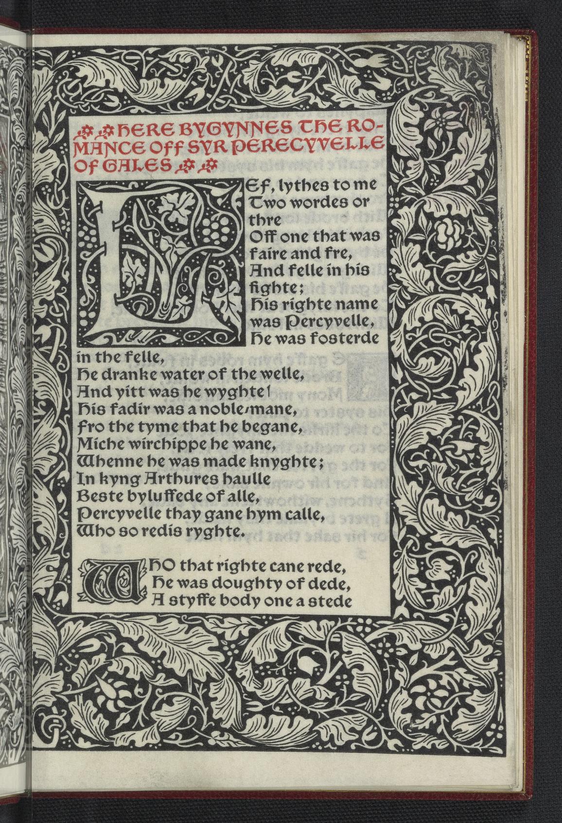
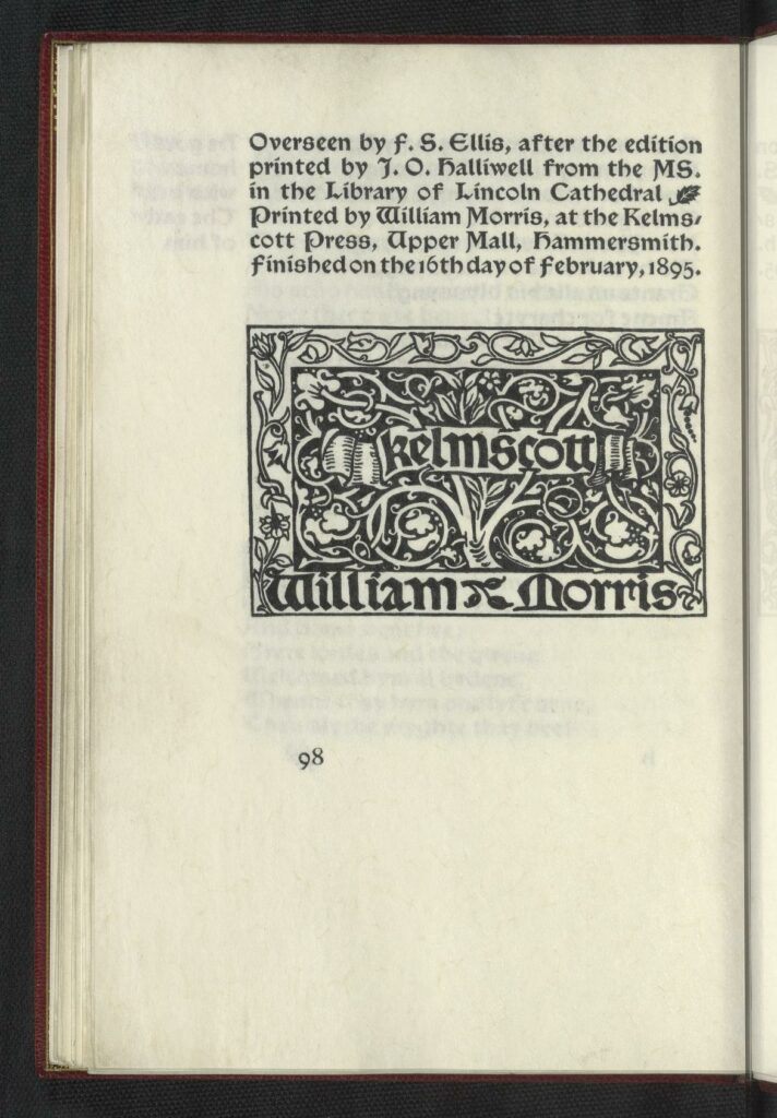
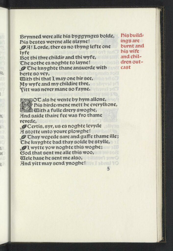
“Overseen by F.S. Ellis, after the edition printed by J.O. Halliwell from the ms. in the library of Lincoln Cathedral”
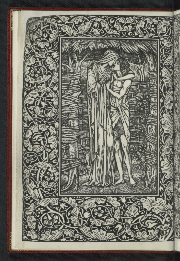
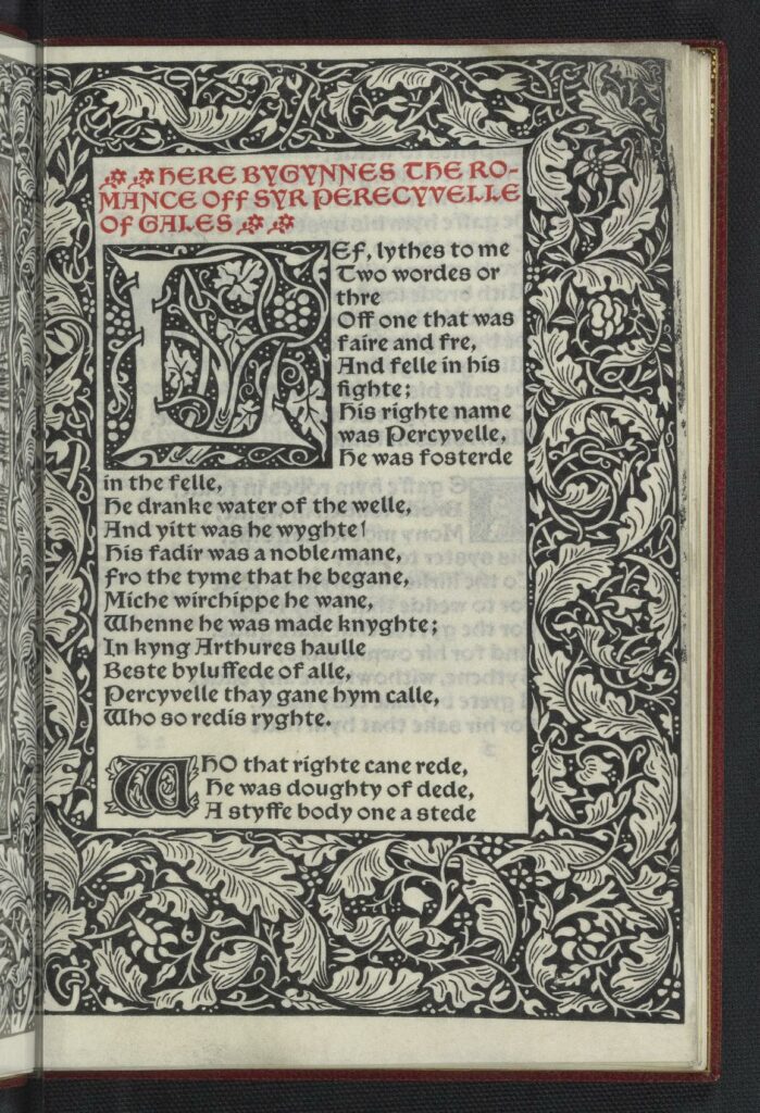
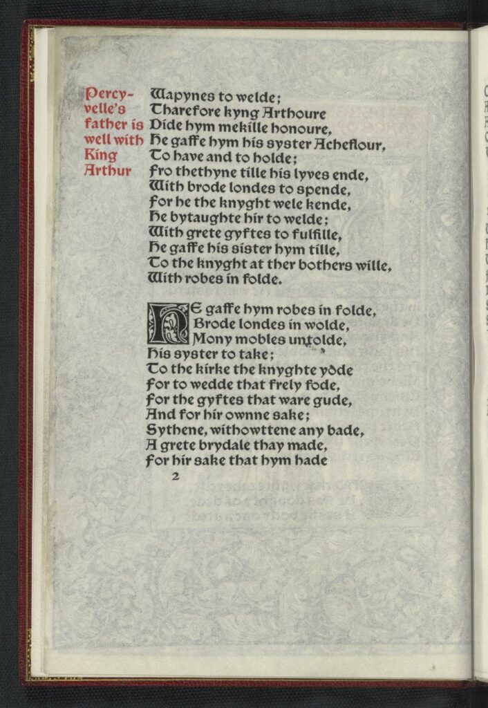
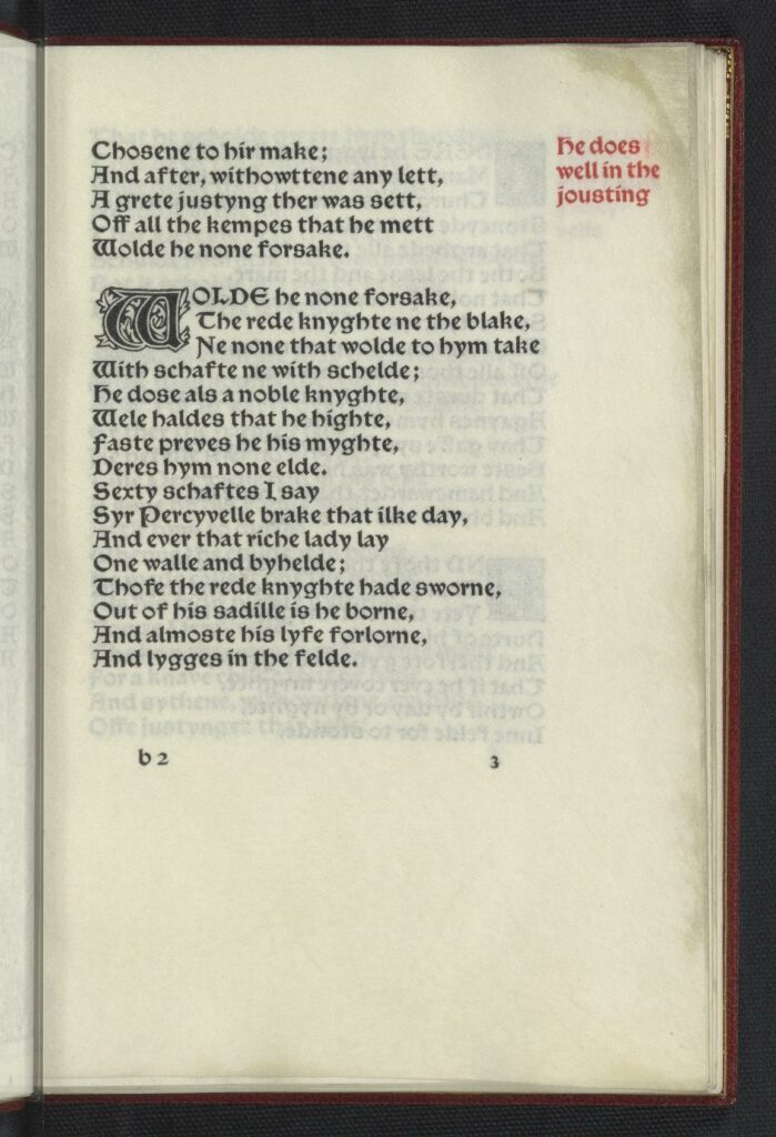
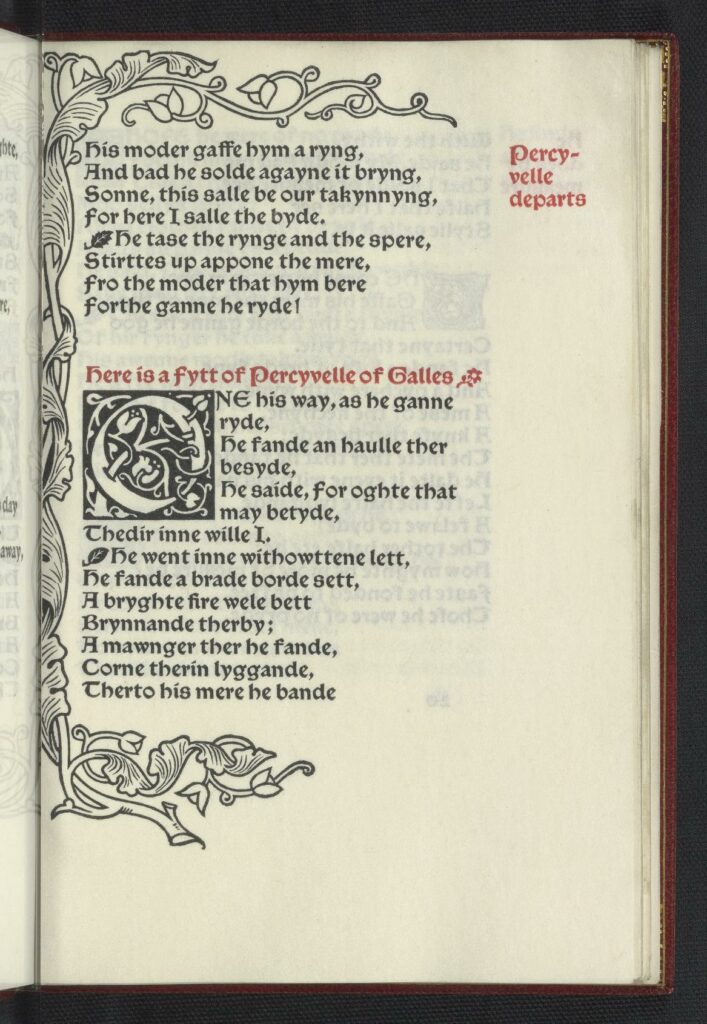
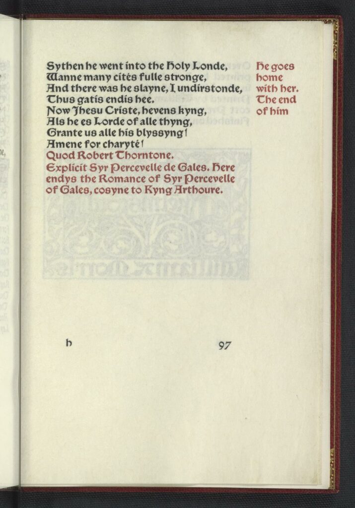
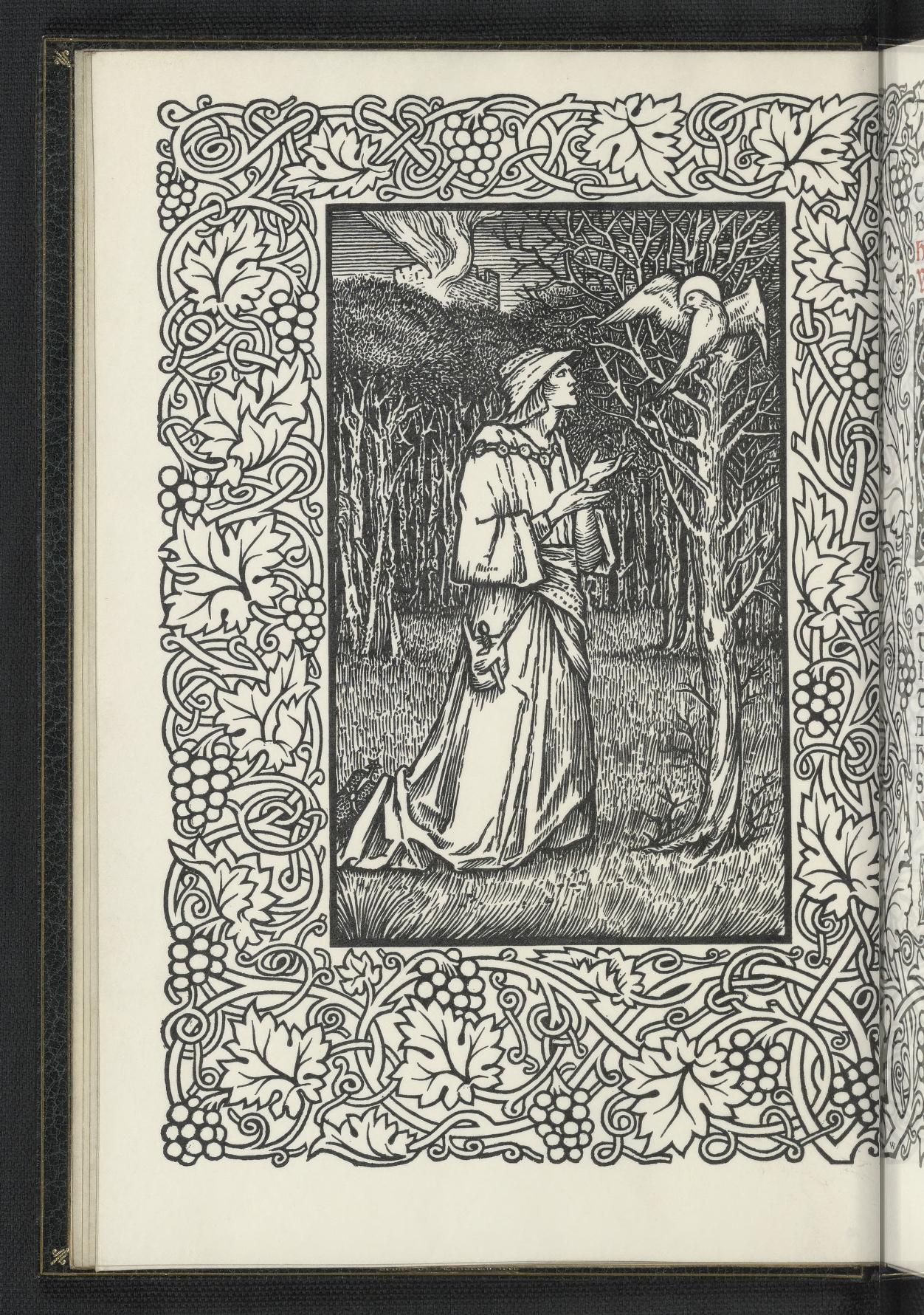
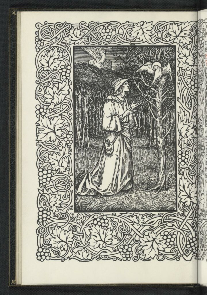
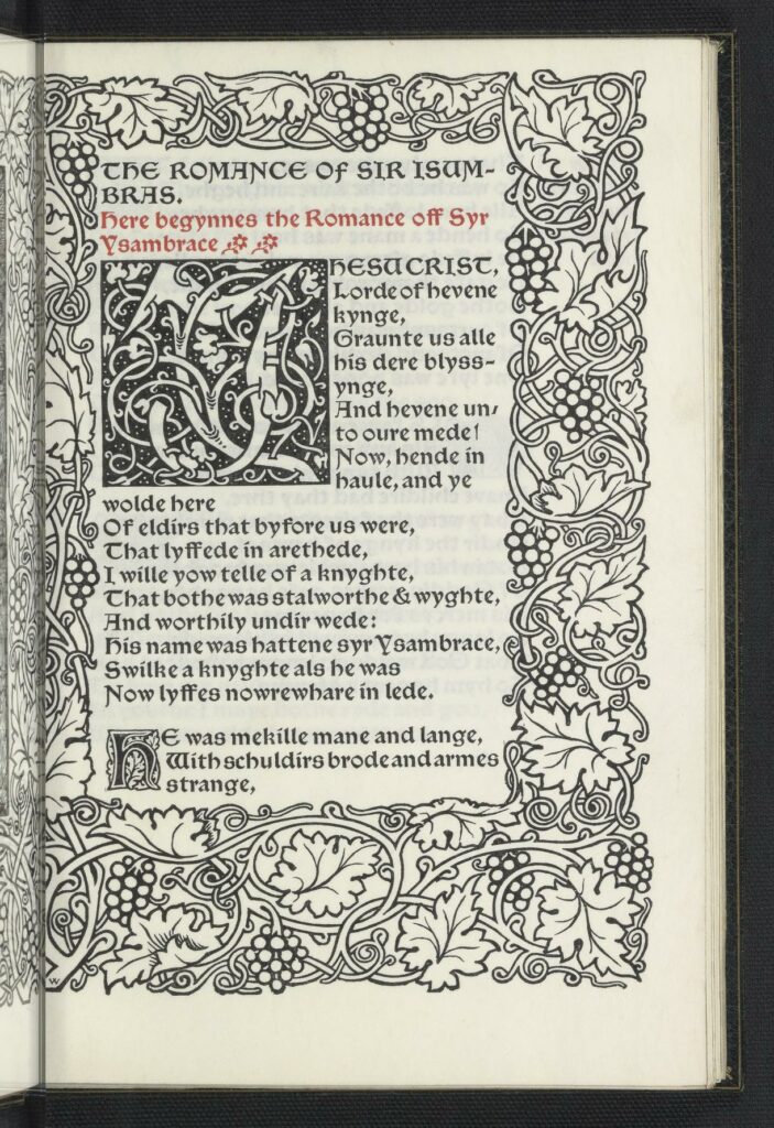
Bibliography: “Overseen by F. S. Ellis, after the edition edited by J. O. Halliwell from the Thornton MS. in the Library of Lincoln Cathedral. 8 vo. Chaucer type. In black and red. Borders 13a and 13, and a woodcut designed by Sir E. Burne-Jones. 350 on paper at fifteen shillings, 8 on vellum at four guineas. Dated Feb. 16, issued May 2, 1895. Published by William Morris. Bound in limp vellum. This is the first of the series to which Sire Degrevaunt & Syr Isumbrace belong. They were all reprinted from the Camden Society’s volume of 1844, which was a favorite with Mr. Morris from is Oxford days. Syr Perecyvelle was first announced int eh list of Dec 1., 1895. The shouldernotes were added by Mr. Morris.” (40)
Bibliography: “Being thirty-five reproductions from books that were in the library of the late William Morris. Edited, with a list of the principal woodcut books in that library, by S.C. Cockerell. Large 4to. Golden type. In red and black. 225 on paper at thirty shillings, 8 on vellum at five guineas. Dated Dec 15, 1897, issued January 6, 1898. Published at the Kelmscott Press. Bound in half holland. Of these thirty-five reproductions twenty-nine were all the were one of a series chosen by Mr. Morris to illustrate a catalogue of his library, and the other six were prepared by him for an article int eh 4th number of Bibliographica, part of which is reprinted as an introduction to the book. The process blocks (with one exception) were made by Walker & Boutall, and are of the same size as the original cuts.”
Syr Ysambrace. Hammersmith : Kelmscott Press, 1897.
Published Posthumously.
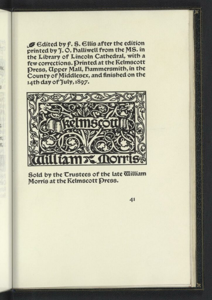
“Edited by F. S. Ellis after the edition printed by J.O. Halliwell from the MS. in the Library of Lincoln Cathedral, with a few corrections. Printed at the Kelmscott Press, Upper Mall, Hammersmith, int eh County of Middlesex, and finished on the 14th day of July, 1897. Sold by the Trustees of the late William Morris at the Kelmscott Press.” (41)
Bibliography: “Edited by F.S. Ellis after the edition printed by J.O. Halliwell from the MS. in the Library of Lincoln Cathedral, with some corrections. 8vo. Chaucer type. In black and red. Borders 4a and 4, and a woodcut designed by Sir Edward Burne-Jones. 350 on paper at twelve shillings, 8 on vellum at four guineas. Dated July 14, issued Nov. 11, 1897. Published at the Kelmscott Press. Bound in half holland. This is the third and last of the reprints from the Camden Society’s volume of Thornton Romances. The text was all set up and partly printed by June, 1896, at which time it was intended to include ‘Sir Eglamour’ in the same volume.” (55)
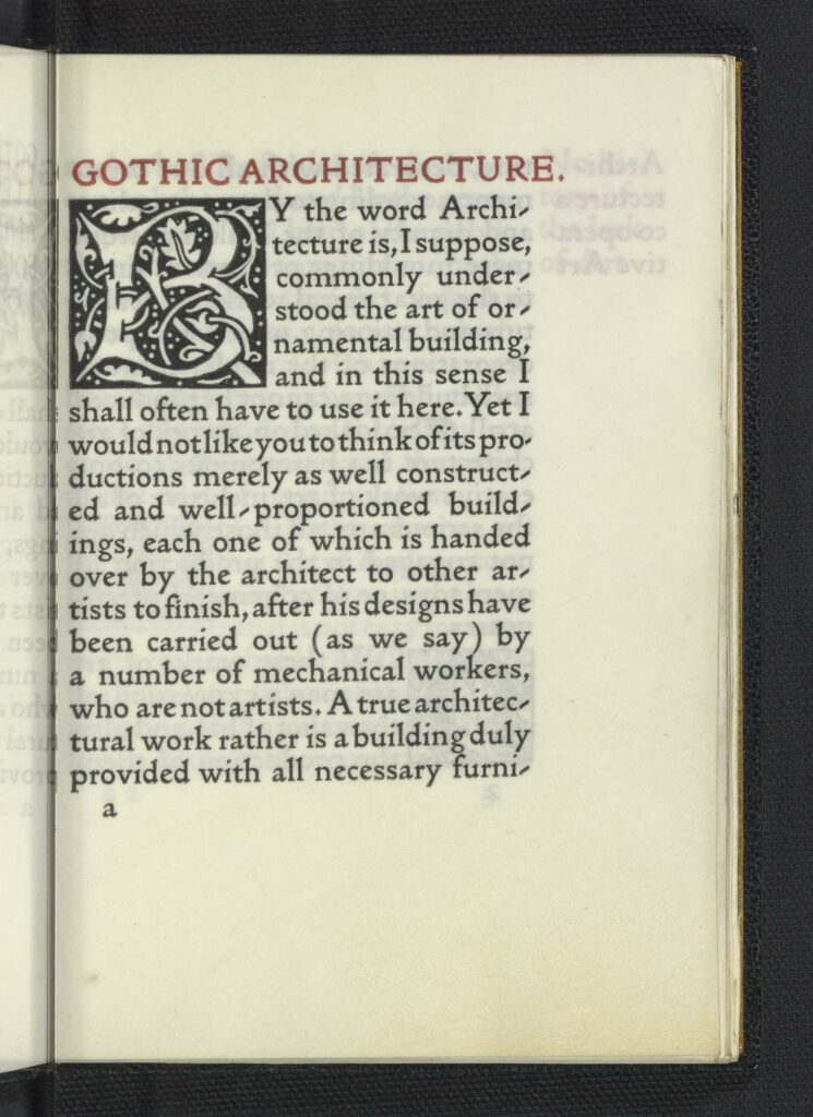
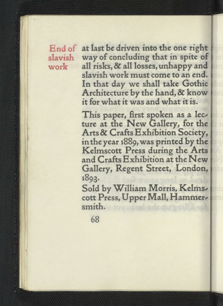
“This paper, first spoken as a lecture at the New Gallery, for the Arts & Crafts Exhibition Society, in the year 1889, was printed by the Kelmscott PRess during the Arts and Crafts Exhibition at the New Gallery, Regent Street, London, 1893. Sold by William Morris, Kelmscott Press, Upper Mall, Hammersmith.” (68)
Bibliography: “16mo. Golden type. In black and red. 1500 on paper at two shillings and sixpence, 45 on vellum at ten and fifteen shillings. Bound in half holland. This lecture was setup at Hammersmith and printed at the New Gallery during the Arts and Crafts Exhibition in October & November 1893. The first copies were ready on October 21, and the book was twice reprinted before the Exhibition closed. It was the first book printed in 16mo. The four-line initials used in it appear here for the first time. The vellum copies were sold during the Exhibition at ten shillings, and the price was subsequently raised to fifteen shillings.” (32-33).
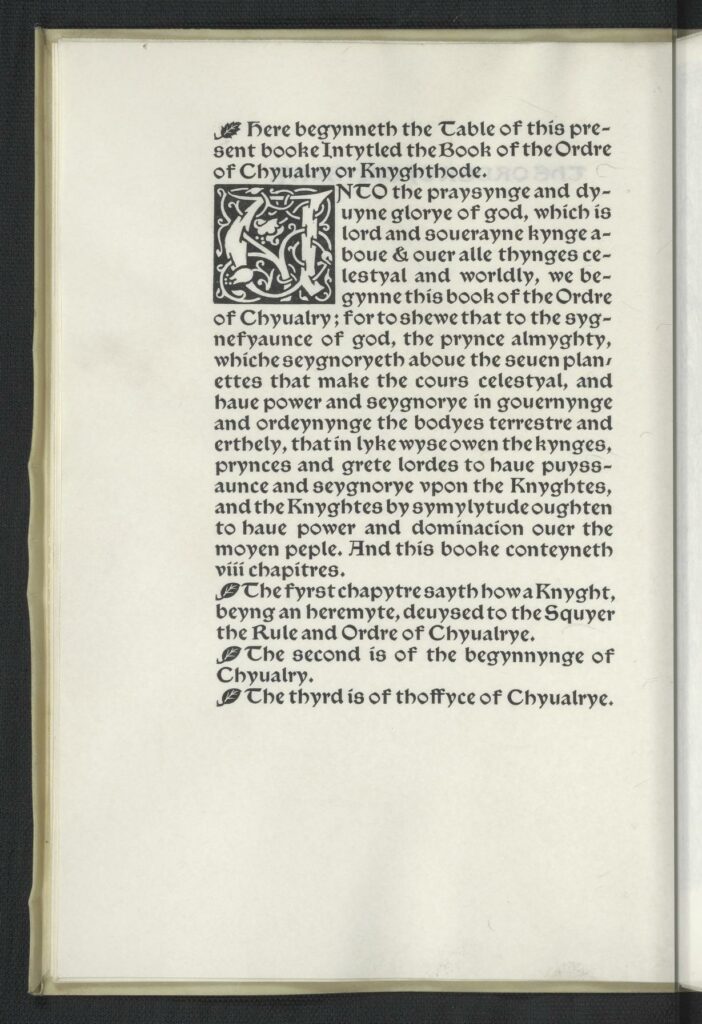
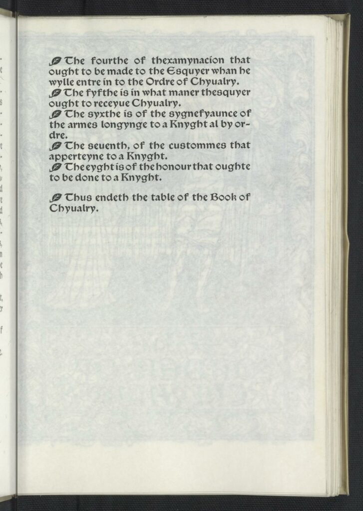
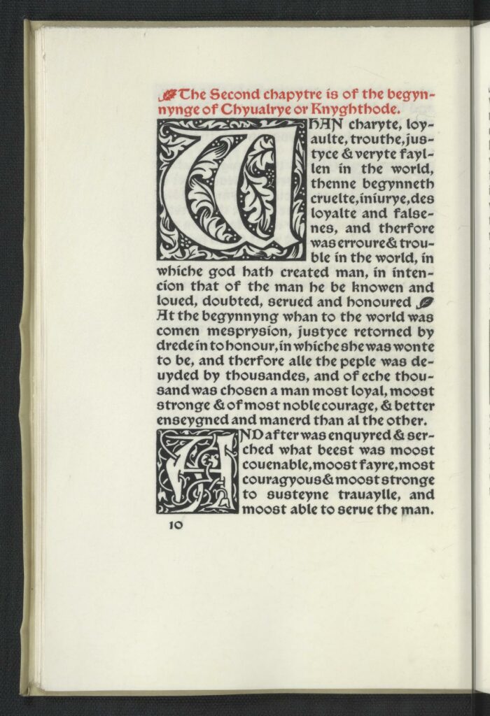
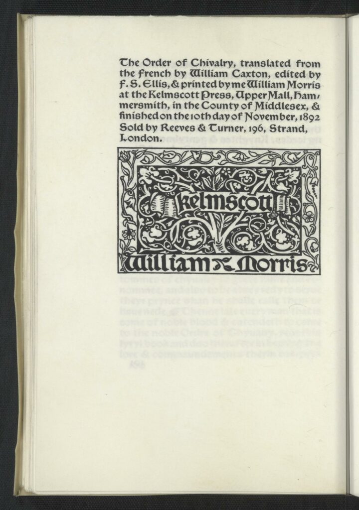
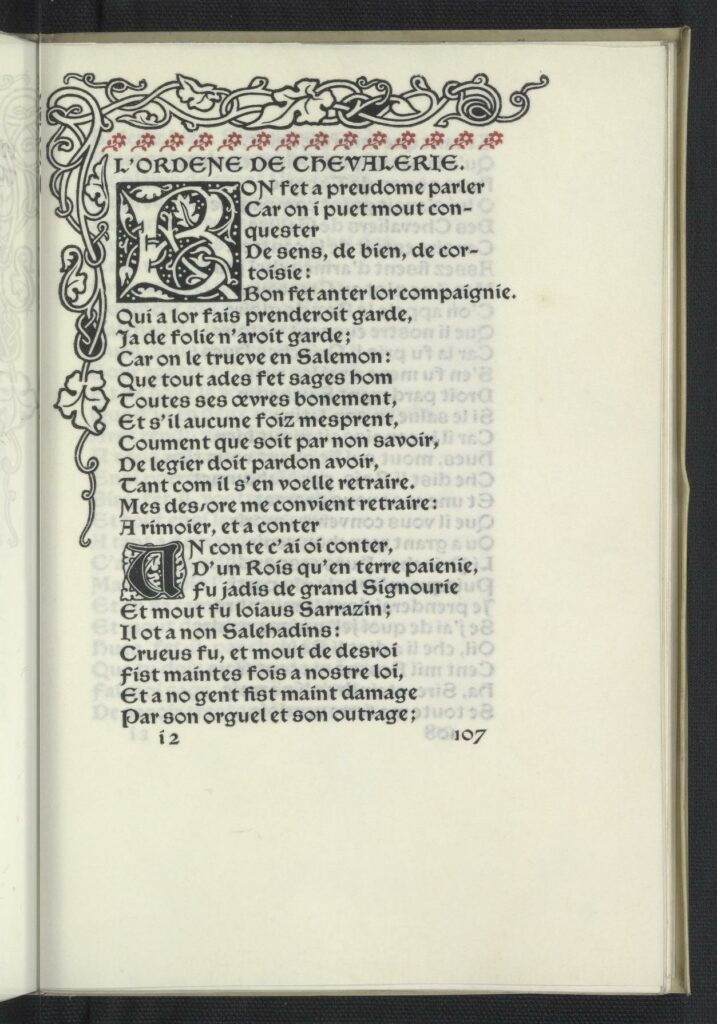
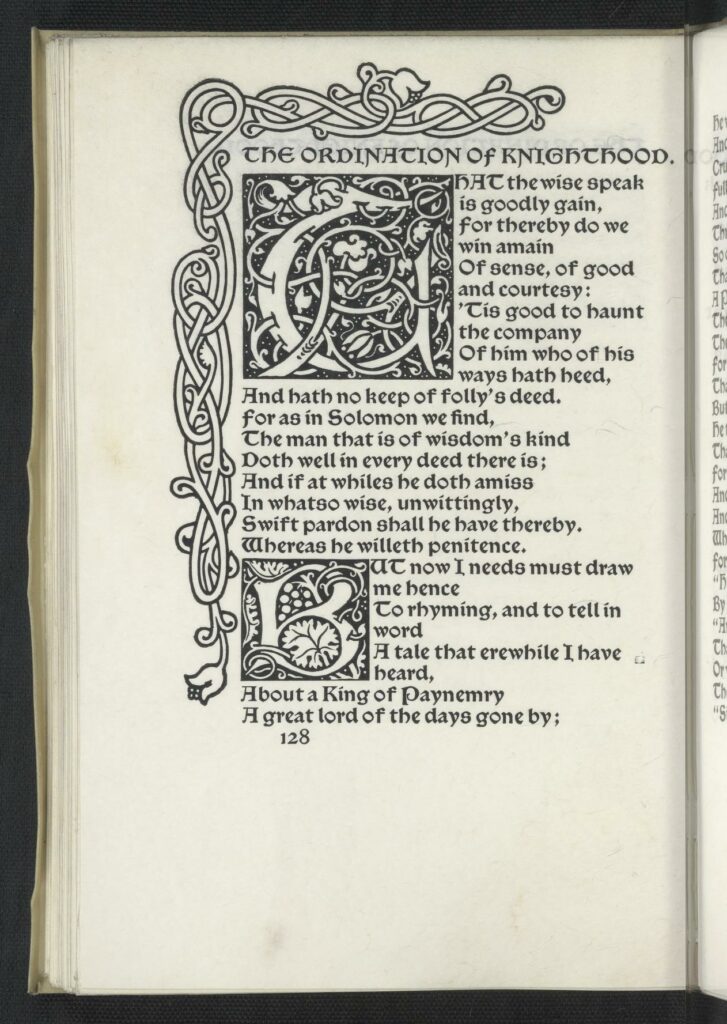
Bibliography: “The Order of Chilvalry. Translated from the French by William Caxton and reprinted from his edition of 1484. Edited by F.S. Ellis. And L’ordene de Chevalerie, with Translation by William Morris. Small 4to. Chaucer type, in black and red. Borders 9a and 4, and a woodcut designed by Sir Edward Burne-Jones. 225 on paper at thirty shillings, 10 on vellum at ten guineas. The Order of Chivalry dated Nov. 10, 1892, L’Ordene de Chevalerie dated February 24, 1893, issued April 12, 1893. Sold by Reeves & Turner. Bound in limp vellum.” 30
Memoranda – The Ordination of Knighthood
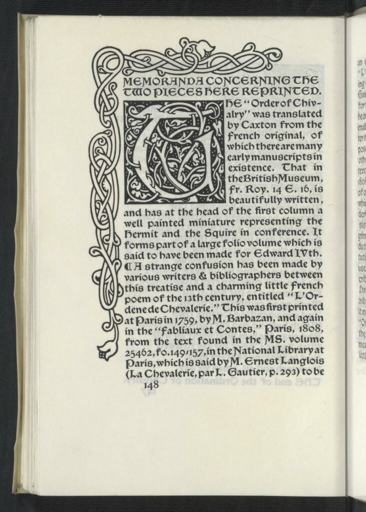
F. S. Ellis[148]MEMORANDA CONCERNING THE TWO PIECES HERE REPRINTED.THE “Order of Chivalry” was translated by Caxton from the French original, of which there are many early manuscripts in existence. That in the British Museum, Fr. Roy. 14 E.16, is beautifully written, and has at the head of the first column a well painted miniature representing the Hermit and the Squire in conference. It forms part of a large folio volume which is said to have been made for Edward IVth.A strange confusion has been made by various writers & bibliographers between this treatise and a charming little French poem of the 13th century, entitled “L’Ordene de Chevalerie.” This was first printed at Paris in 1759, by M. Barbazan, and again in the “Fabliaux et Contes,” Paris, 1808, from the text found in the MS. volume 25462, fo.149-157, in the National Library at Paris, which is said by M. Ernest Langlois (La Chevalerie, par L. Gautier, p. 293) to be [149] an excellent one. M. Langlois speaks of “L’Ordre de Chevalerie” as a prose rendering of the XIIIth century poem, and M. Gautier appears to have adopted this view, for while he gives a summary of the poem, he omits all mention of the prose work. To enable those who are interested in the matter to judge how far there is reason to suppose that the one work is drawn from the other, the poem is here reprinted from the text given in the “Fabliaux et Contes,” 1808. It will be seen that while it consists of only 510 lines, or about 2750 words, of which not more than half relate to the Ordering of Knighthood, the prose work consists of about 18000 words and is from beginning to end devoted to describing the duties of a Knight, the manner of his institution, & the symbolism of the ceremonies used on the occasion. As the poem is ascribed to the 13th century, and the learned Director of the French National Library attributes the prose work to the 14th century, it might very well be that the author of the “Ordre de Chevalerie” was acquainted with the earlier work & might have been in some measure inspired by it. But there can be little doubt that the symbolizing of the [150] ceremonies of Knighthood was a matter of common knowledge in the 13th and 14th centuries, or probably at a much earlier date, & is as little likely to have been originated by the author of the earlier work as by the compiler of the later one. The French version of the “Ordre de Chevalerie” was not printed till 1504 and even then it did not appear as a treatise on Chivalry, but as a part of “Le Jeu des Eschez moralise,” printed at Paris for A. Verard. In 1510 it was printed at Lyons, but was then put forth as the work of Symphorien Champier, though it had been written a hundred years or more before he was born. This tardy & obscure mode of publication is good evidence how entirely dead, by the end of the 15th century, was the spirit of Chivalry as understood by the writers of these books. Caxton appears, from his eloquent appeal at the end of the treatise, to have been a belated lover of Chivalry, but his hope that the publication of this little book would give new life to it was evidently doomed to disappointment, for that no second edition of it was ever produced by him is of itself good proof that his appeal fell on deaf ears. How little interest the [151] subject aroused is also shown by the fact that no other English typographer either of the 15th or 16th centuries was at the pains to reprint the book.The interest that it has now as an historical document is considerable, and the wonder is that it has not been reprinted before this time in our own days.F. S. Ellis.Colophon:THIS Ordination of Knighthood was printed by William Morris at the Kelmscott Press, Upper Mall, Hammersmith, in the Country of Middlesex; finished on the 24th day of February, 1893.
That in the British Museum fr. Roy. 14 E.16 is beautifully written, and has at the head of the first column a well painted miniature representing the Hermit and the Squire in conference. It forms part of a large folio volume which is said to have been made for Edward IVth.
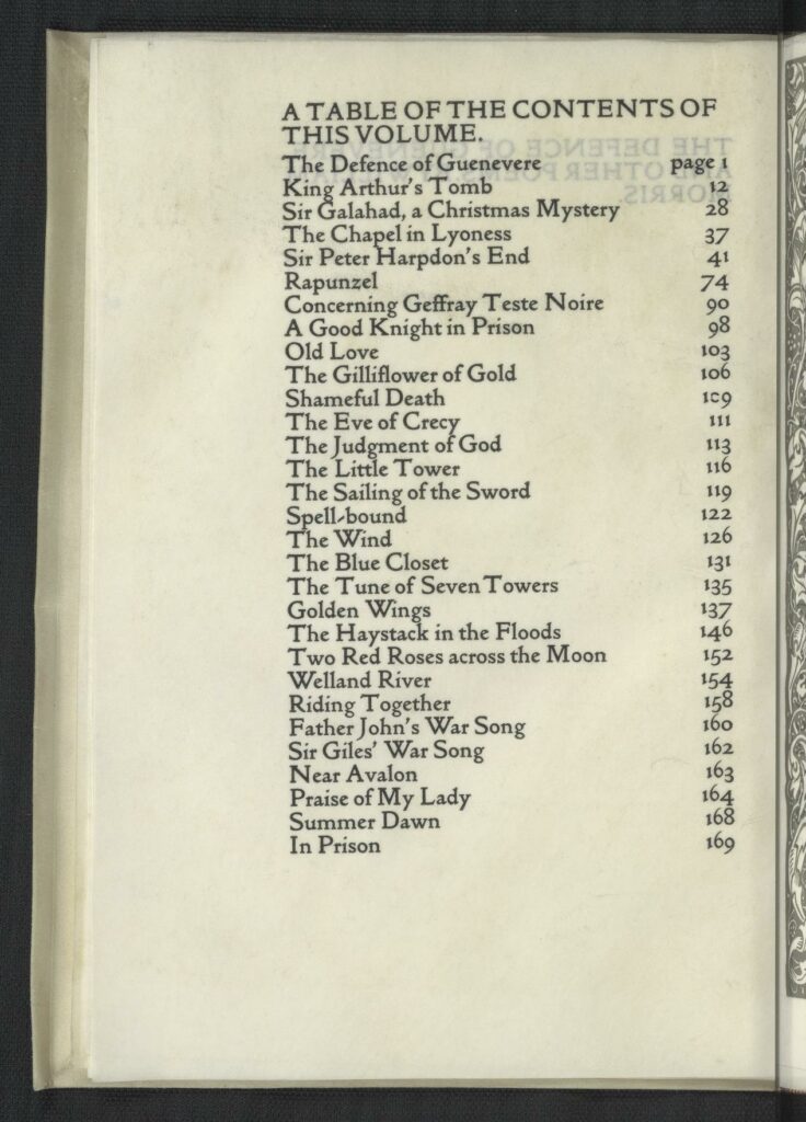
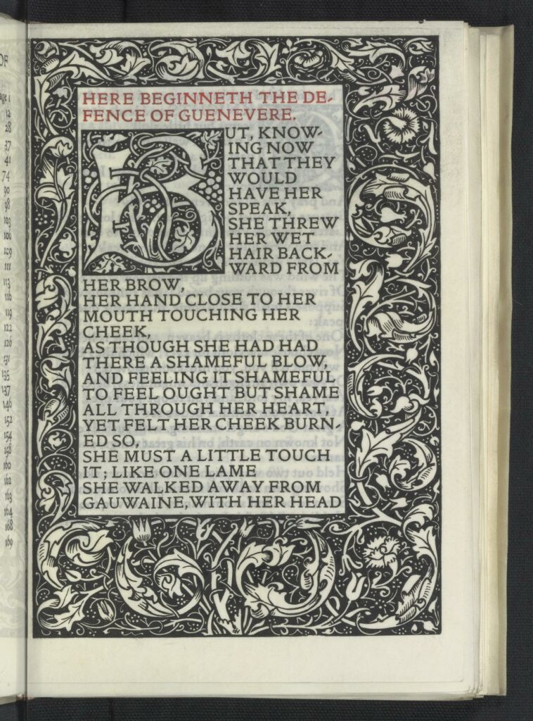
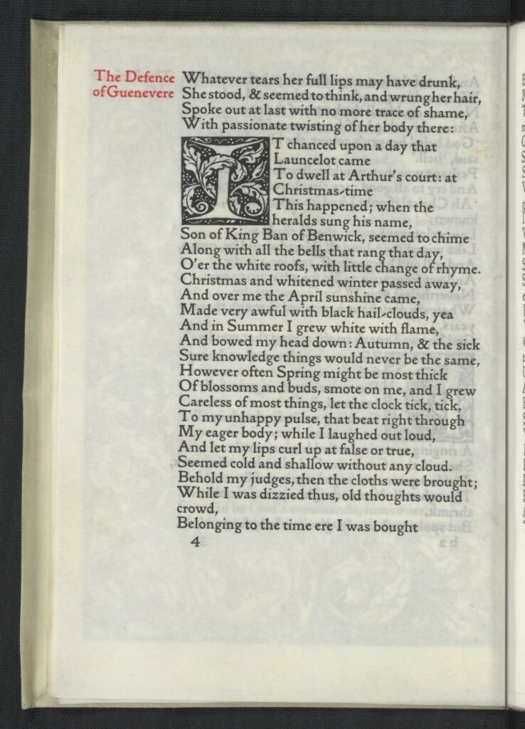
Bibliography: “Small 4to. Golden type. In black and red. Borders 2 and 1. 300 paper copies at two guineas, ten on vellum at about twelve guineas. Dated April 2, issued May 19, 1892. Sold by Reeves & Turner. Bound in limp vellum. This book was set up from a copy of the edition published yb Reeves & Turner in 1889, the only alteration, except a few corrections, being in the 11th line of Summer Dawn. It is divided into three parts, the poems suggested by Malory’s Morte d’Arthur, the poems inspired by Froissart’s Chronicles, and poems on various subjects. The two first sections have borders, and the last has a half-border. The first sheet was printed on February 17, 1892. It was the first book bound in limp vellum, and the only one of which the title was inscribed by hand on the back.” (24)